Finally out of the summer convention season but as with most Fall seasons the comic books never seem to slow down and there are quite a few new series that are hitting the shelves and a reviews work is never done so let’s get started.
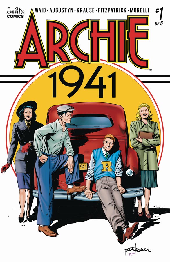
Archie 1941 #1
Archie Comics Writers Brain Augustyn & Mark Waid, Artist Peter Krause, Colorist Kelly Fitzpatrick, Letterer Jack Morelli
This bridge mini series from the ending of the Waid era of the revamped Archie Comics this sort of Elseworlds story transports the Riverdale gang to just before America goes into WWII is an interesting concept is a little slow on the take off but does lay some nice groundwork for the overall story. This first issue is pretty much exposition and setting up the character arc’s in the story. On the surface Augustyn and Waid’s script seems to be a bit on the slower side but I get that they took the time to set things up and let the story breath and while it may not be exciting for some it does however build up nicely as you get to the end of this first chapter. As Waid hs shown time and time again with the regular series that he doesn’t try to change what we love about Archie and the cast but here he and Augustyn simply place them in a more grounded story than I have ever seen done in the Archie Universe and that is why it feels different but in a good way because of the serious tone of the subject of war. Krause does a nice job on the art that gives the story a little realistic look to fit the mood and era but still keeps the feel of the Riverdale gang but in a more subdued way than were normally used to. This story is firmly planted in reality and Krause does a good job of balancing the two.
Is this book worth your time and money? While I wasn’t blown away by this first issue, I do think that Waid and Augustyn made a lot of good and bold choices with the story and you have to look at it as the first of five chapters with this issue dealing with exposition and set up. Both story and tone are spot on and it will be interesting to see where they go with the overall story. This is neither Archie or Riverdale but it strikes out with it’s own voice and that is a good choice.
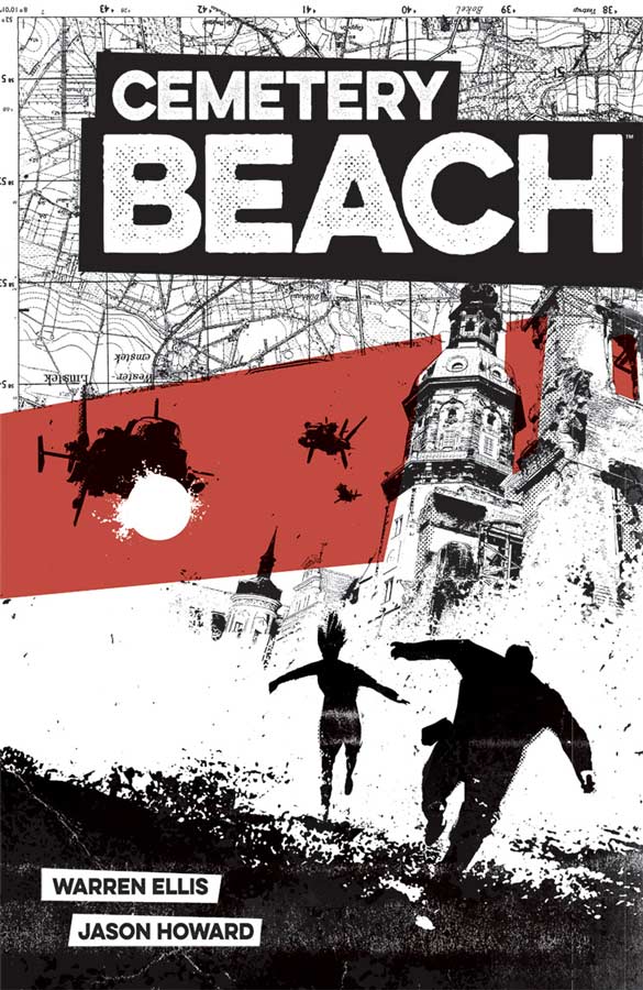
Cemetery Beach #1
Image Comics Writer Warren Ellis, Artist Jason Howard, Letterer Fonografiks
Ellis never seems to disappoint with his books that seem to start one way then pull the rug out from under the reader that catches them totally off guard and he does that quite nicely here with Cemetery Beach. What is interesting about his writing style is that it always keeps you guessing as to what the heck is going on because just when you think its going to go one way he gives it a twist and goes in another direction. The story is a basic concept of two worlds that are the same but different and has given it a nice twist that gives this story a fresh feel. In a lot of ways you’re not totally sure as to where the story is going to go but at least this first outing is a hell of a ride and there is enough here and with the ending of this first issue should give most readers enough to come back for more. Howard’s artwork does a superb job of capturing both the exciting action and the drama scenes with ease. There are many times where there is no dialog and Howard is able to convey Ellis’s script perfectly and show his strong art skills.
Is this book worth your time and money? I’m not totally sure where Ellis and Howard are going with this story but I did like this first outing enough to see where the second issue takes it. Ellis’s script dispenses with they usual exposition and tends to unfold it over time to keep the story moving along and that works well out of the gate for this book. It’s worth checking out if you’re a fan of Ellis’s work and a good one for readers not as familiar with his work.
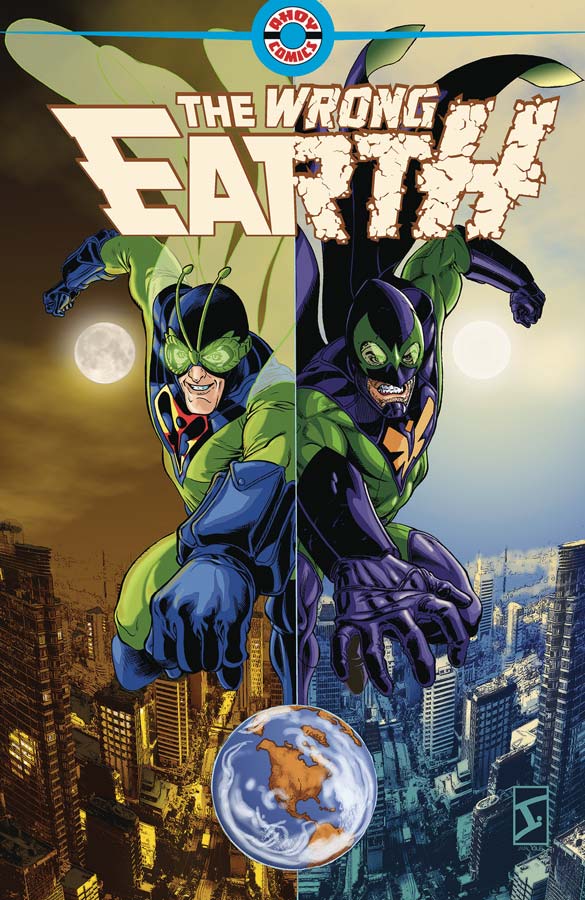
The Wrong Earth #1
Ahoy Comics Writers Tom Peyer/Paul Constant/Grant Morrison/Shannon Wheeler, Artists Jamal Igle/Frank Cammuso/Rob Steen/Shannon Wheeler, Colorist Andy Troy, Letterer Rob Steen
Another new comic company jumping into an overcrowded marketplace is going to be a hug uphill battle and with Ahoy Comics first comic it gets off to a fairly decent start. The books main story by Peyer and Igle is a very familiar take on the old Mirror Mirror story with two worlds that are opposites of each other and been many times before. The Earth-Alpha is very obviously Batman ’66 era and there is no disguising that this is a Batman clone story and while it’s a fun read, it does however fall into the been there and done that scenario and sadly doesn’t really bring much new to the table here. I had wished that Peyer’s story had at least tried to do something that I didn’t expect but sadly it never quite did. I will say that Igle’s artwork does give the story a big push visually and does help you not mind that you have read this story a million times before. He does a nice job on giving both worlds distinctive looks but again to easy but that issue lies in the scripting. The second story is much-needed after the main story and Constant and Cammuso deliver a throwback type of story to the golden age of comic with both tone of story and wonderful visuals. It’s a simple story and that is why it works so well. It never tries to be more than it is and makes no claims to be. The big win for this story is that its simply charming and fun and that is what makes it the big win for this book. There are two interviews with the creators and a prose story by Morrison and a gag cartoon from Wheeler that is always nice to see more Too Much Coffee Man in print.
Is this book worth your time and money? I really wanted to like this book being that they did try to almost delivered a good comic. What really hurt the main story is that it didn’t bring anything new to the table and was just another telling of an average superhero story. There are already too many superhero books and this one is just not enough to recommend. It certainly not terrible but not enough to spend your hard-earned money on. SKIP IT!
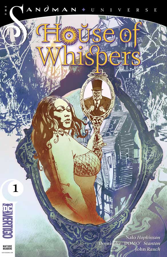
House of Whispers #1
Vertigo Comics Writer Nalo Hopkinson, Artist Dominike “Domo” Stanton, Colorist John Rauch, Letterer Deron Bennett
The second of the new Sandman Universe is a sad miss for me and that was pretty disappointing because it was one of the stronger ones of the Sandman Universe book a few weeks ago. The biggest problem is with Hopkinson’s script that is disjointed and is simply too hard to follow. This seems to be a real problem for novelist who try to write comics and have issues with the structures of a monthly comic. It’s not to say that there are not some good ideas here and there are but there was very little characterization and little for the reader to really care about most of the cast beyond the minor surface story that wasn’t very compelling. I do think however that if she is able to focus the story and build the characters out that this book could turn around but its pretty hard to see if that can happen from this first outing. Stanton’s artwork on the book is a mixed bag and times where it’s quite good but sometimes there are some real consistency issues from panel to panel. There is also a noticeable lack of backgrounds that gives the artwork a flat feel and doesn’t really take advantage of the feeling of a fantasy world or the real world. Unfortunately Rauch’s color work is drab and sadly doesn’t do the book any favors.
Is this book worth your time and money? I really was looking forward to this book being a fan of House of Mystery with Cain and Able but this book is a real mess in both story and artwork. It’s not only difficult to recommend but hard to see me even giving the book a second issue with the huge disappointment with this first issue. SKIP IT!
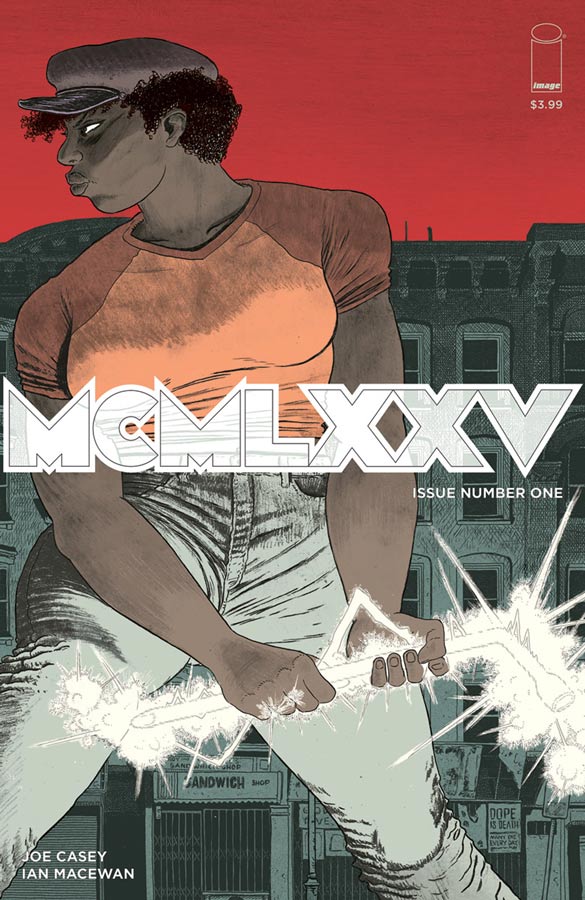
MCMXXV #1
Image Comics Writer Joe Casey, Artist Ian Macewan, Colorist Brad Simpson, Letterer Rus Wooton
I liked MCMXXV at first but as I keep reading this first issue I found myself finding too many homages and realized that Casey is just delivering a mishmash of too many. Lets see there is the Warriors, Mage, Sin City that are the easiest to spot. While it does make for a fairly enjoyable read, there is simply not much originality here and that is where I struggled with the book. It’s like watching the recent Skyscraper with Dwayne Johnson would be the greatest action movie you’ve ever seen unless you have seen Die Hard and the Towering Inferno. This book has the same issue. I would rather read a story that captures the spirit of homage then blatantly rip them off as Casey has done here. For a lot of readers they will never see this because of their lack of knowing a lot of the concepts that he steals from. Macewan suffers a bit with the art with the same issue that it has a lot in common with both Frank Millar and Matt Wagner’s style of artwork that could be on purpose considering the script that may have been a conscious choice and if that’s the case it make sense to mirror the scripts layout. Setting that aside I did like his layouts for the art and he does a nice job with both the action and drama. He also put a good amount of detail into the art that does help the book along.
Is this book worth your time and money? There is a thin line between homage and theft and sadly this one is far too close to the latter for me. For me the book is just a bunch of lifted elements with very little original spin put on them. I get that Casey loves these ideas but honestly this is not original and a bit embarrassing. SKIP IT!
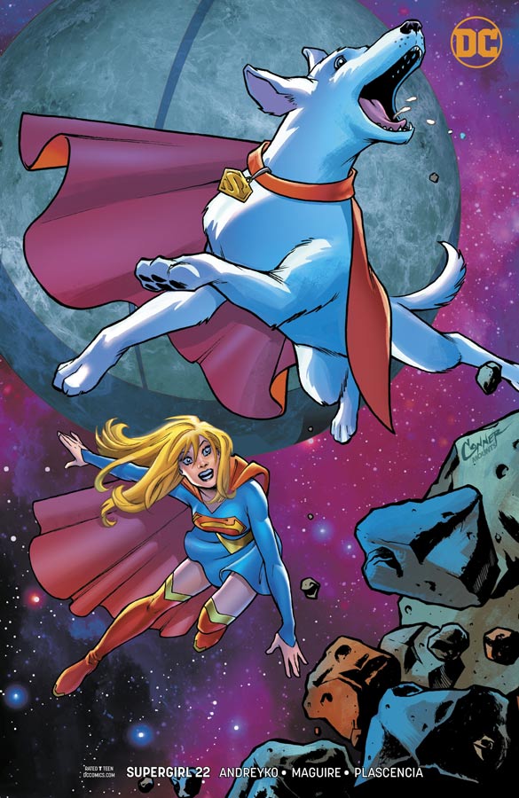
Supergirl #22
DC Comics Writer Marc Andreyko, Penciller Kevin Maguire, Inker Sean Parsons, Colorist FCO Plascencia, Letterer Tom Napolitano
The first issue of this new creative team on the book really hit the ground running on their first outing and this second issue shows that was no fluke. Andreyko continues to build nicely on the story threads from the new Bendis Superman stories but does make this book stand on it’s own and what I like the direction he is taking with it. What I like most about this story so far is how he is building Kara as a character on her journey. While her journey to find answers Andreyko doesn’t forget to make sure there is still fun and humor along the way and that is what is making this story so fun and charming. This is the first time in quite a while where a writer of Supergirl has really gotten a handle on her and brought her out of the shadow of her cousin. Another big win for this story is adding Krypto to the mix and on the surface he may seem like a humorous sidekick but Andreyko is making sure that he is becoming much more than a one note joke. Having Maguire draw this book continues to be a real treat and he brings his best art yet to the book. One of the best assets that he brings is the subtle emotions that he infuses the characters with and not just the human ones. His visual take on Krypto might just be the best one ever. This book is a keeper!
Is this book worth your time and money? One thing that is a big win for this book is that Andreyko is not only moving the story forward nicely but he is also telling the story in issue chapters that is giving a reason to buy these monthly stories. Throw in Maguire’s gorgeous artwork and you have a real winner on your hands that continues to impress and a solid reason to buy this book. VERY RECOMMENDED!
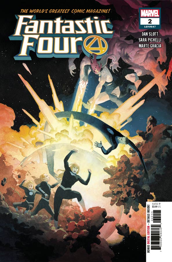
Fantastic Four #2
Marvel Comics Writer Dan Slott, Penciller Sara Pichelli, Inkers Sara Pichelli with Elisabetta D’Amico, Colorist Marte Gracia, Letterer Joe Caramagna
I was not a fan of the first issue because it was a simple cash grab by Marvel for an overpriced issue with little substance and basically a prequel that you really didn’t need to seem to have to read. Guess what I was totally right in that if you skipped the first issue you could simply start with the second one and hit that nail on the head. Honestly the story starts here so if you didn’t buy the first issue you’ve missed nothing and can jump right in. Slott actually hits the ground running this issue and while this is not the greatest FF story that you will ever read, I did find it enjoyable and has the possibility of growing on me. The big key is that it feels like the Fantastic Four that a lot of writers seem to miss throughout the years. He handles the family aspect pretty well here and shows promise for at least this first story arc. I have to say that Pichelli’s artwork on this second issue is a huge improvement over the first in that its much more detailed and focused than the first issue was. She was a little rough around the edges but this issue shows that she can handle the scope of the story but still handle the small little details that are key to the book working.
Is this book worth your time and money? While I’m still hesitant with the book after the bad taste from the first issue fiasco, this second issue gives me hope that the book is on track for at least this early in the game. Slott seems to have come up with a story that gets the team back together but it’s too early to see if he is able to come up with stories beyond this first story arc. Pichelli worried me with her inconsistent artwork in the first issue but she really stepped up her game here and delivers the goods. Still not a super strong recommendation yet but a better jumping on point for sure this second issue.


0 Comments