Another big week with DC kicking off the Heroes in Crisis story and Stranger Things lands from Dark Horse but can it capture the magic of the show. Read on to find out?
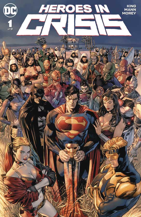
Heroes in Crisis #1
DC Comics Writer Tom King, Artist Clay Mann, Colorist Tomeu Morey, Letterer Clayton Cowles
As you pretty much know by now that I’m not a fan of event comics because they are mostly just sales boost for the publisher and offer little depth or consequences overall to the characters and their books. I have to hand it to King for the first time in as long as I can remember the first issue was not only readable but didn’t have the usual slow plodding exposition that is the norm. In a lot of ways he throws that basic set up out the window and starts fresh here by simply leaving the readers wrapped up in the mystery of the story and not necessarily aiming for shock value (maybe). In a lot of ways this story mirrors King’s work on the brilliant Mister Miracle series where he actually reveals a lot but at the same time keeping many things hidden and lots of questions but in a weird way it works very well here. The bigger question going forward is going to be if the deaths that occur in this story will actually stick or will be a temporary story. I also hope that he and DC are not just thinning the heard just because of shock value. IT’s too early to call with just this first issue but I will say that King handled all of the emotions of the story quite well and it didn’t feel forced or cheap. Mann delivers some really great artwork on this book and sets the bar a lot higher than most event books that have big names that end up making the book look like a paycheck instead of putting the effort into it. He handles the big and small scenes perfectly and captures the emotions of the script that makes this book really shine. I have to give props to Morey’s color work on this book is spot on and really adds so much more to Mann’s line work. He gave the book a nice painted feel and look that really adds to the overall feel of the book with a strong yet spot on approach to the colors.
Is this book worth your time and money? I have to say that this book gets off on the right foot in this first outing. While it’s too early to call on where it will go with the story, I will say that I did very much enjoy reading this first issue. King and Mann have delivered an event comic that wisely doesn’t feel like an event and that is a huge complement. It simply sets out to tell a good story and cant wait to see where they take it from here. Well worth checking out. RECOMMENDED!
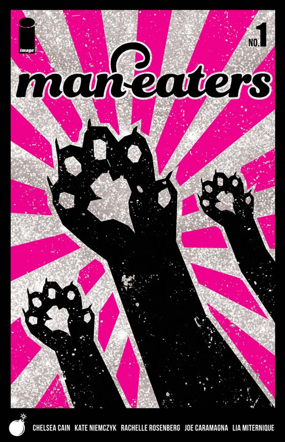
Man-Eaters #1
Image Comics Writer Chelsea Cain, Artist Kate Niemczyk, Colorist Rachelle Rosenberg, Letterer Joe Caramagna
I wanted to like this book more than I did but it does show promise but is a little slow out of the gate. Cain who’s Mockingbird comic over at Marvel was sadly over too quickly and now goes her own way with this creator owned series. There are some good idea that are introduced with this first issue but the problem that I had with the story was that I wasn’t as emotionally invested in the characters as I would have liked to have been. She does set up the basic premise of the story well here in the first issue but you never really get to know. The daughter’s name is never revealed and I had to go back and look to find the dads name and it appears to be Henson but not sure if it’s a first or last or even him. This is a big flaw in starting this book out because if you don’t know the characters names how are you supposed to care what happens to them. The one thing that does work is the set up to the story that is quite interesting but with little to grasp onto with this first issue it ends up being a mixed bag. Niemczyk’s artwork is nice but there was a bit of stiffness here and there but overall the artwork is pleasant and delivers the script well.
Is this book worth your time and money? I wish that Cain had started this book off on a better footing and it’s not to say that it was bad but there were some structure issues with the script that just made this first issue a bit too messy out of the gate. It’s not to say that the book doesn’t show promise because even with the missteps the underlying story is intriguing and I’m willing to give the second issue a chance. It was simply underwhelming as a first issue.
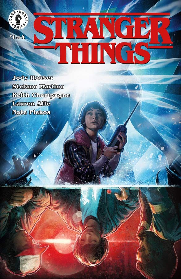
Stranger Things #1
Dark Horse Comics Writer Jody Houser, Penciller Stefano Martino, Inker Keith Champagne, Colorist Lauren Affe, Letterer Nate Piekos
While I have only seen the first season of this great show, I was hoping that this comic might delve into more stories that are on the outside of the main story that couldn’t be told in the regular series. Sadly based on this first issue there is little being brought to the table beyond some very minor insights to the story of Will in the upside down. Houser is a good writer and it’s not that the story is bad here but it doesn’t really add anything more to the story that we already know. I found reading this story simply boring and didn’t have any of the kinetic spark that the show had. In some ways if you changed the title of the book and a few characters names it could simply be a story for another concept. It’s not that the book is bad but it’s wasn’t compelling read. The artwork on the book is good but there were more than a few times where they facial features on the characters were really inconsistent and took you out of the story. I will give Martino and Champagne that they put a lot of detail into the artwork with some really nice backgrounds. I just wish that the faces were a bit better.
Is this book worth your time and money? Only hardcore fans of Stranger Things are going to be interested in this book but for new or more casual viewers of the show I doubt that there is much that they will get out of this. It’s a real shame because this book could have told some compelling out of the television story continuity but it ends up being just so-so and not very memorable. SKIP IT!
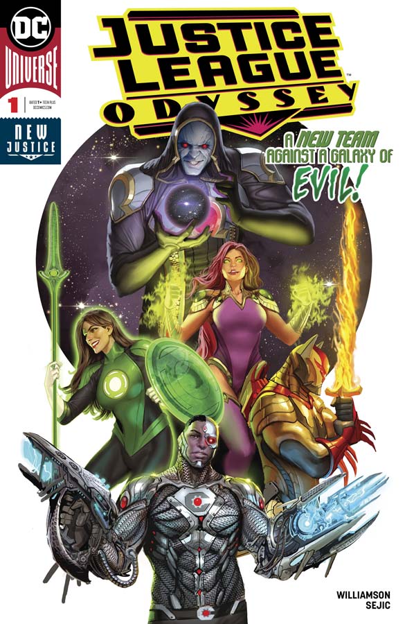
Justice League Odyssey #1
DC Comics Writer Joshua Williamson, Artist Stjepan Sejic, Letterer Deron Bennett
Yet another Justice League spin-off book that ends up being a bit of a bore. Williamson in many instances tends to over dialogue the story that made reading this first issue a real chore at times and it also suffers from telling a lot but ends up not being about very much. It’s not that the team of heroes is bad but there is not much chemistry between them and Williamson doesn’t really bring much new and exciting to the superhero team concept. It’s the basic team thrown together because there is a mystery on another world/planet and when they get their surprise villain shows up. Yep that’s what you get here and while it’s not a train wreck there is not very much that is compelling with the story. The only thing that the book has going for it is Sejic’s gorgeous artwork that really steals the show and made reading this basic story much more palatable but he could only do so much with what he had to work with.
Is this book worth your time and money? DC simply doesn’t need more Justice League books just stick with the core team and then have some rotating cast come in and out of the series. At this point Justice League Dark is only working because it’s taking it’s own path to the dark side of the DC Universe. The man book has been disappointing too and now with this one the Justice League is in some dire need of rethinking. It’s not that this was a bad read but there is very little here that will make you want to come back for a second helping. SKIP IT!
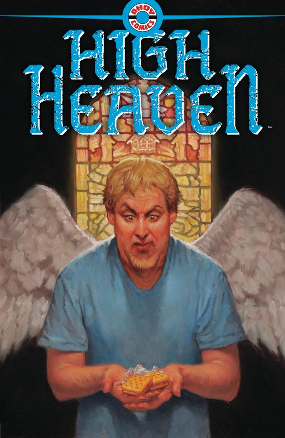
High Heaven #1
Ahoy Comics Writers Tom Peyer/Grant Morrison/Shannon Wheeler, Artists Greg Scott/Shannon Wheeler/Chris Giarrusso/Rick Geary, Colorist Andy Troy, Letterer Rob Steen
Ahoy Comics first outing a few weeks ago with The Wrong Earth got off to a mediocre start but I have to say that High Heaven turns the ship around and delivers an interesting take on the afterlife. At first Peyer’s script is not overwhelming but as the story goes along it come more into focus and really takes off in a direction that is quite compelling and intriguing. He does a nice job of playing with stereotypes of both people and heaven in a way that catches you off guard but in a really good way. It’s also have some nice sly and dark humor that gives the story a nice bite at the same time. Scott provides nice visuals to go with the story and at first I noticed that the backgrounds were a little sparse then it hit me that were in heaven so there is nothing there but clouds so it made a lot of visual sense. He also does nice facial expressions on the characters that really helps deliver the mood of the story well. The back up story by Peyer and Giarrusso is cute but fairly forgettable but still its nice to try to add some value to the overall book with extras. Morrison delivers another text story with spot illustrations by the great Rick Geary that was a nice little read and nice to see Geary’s artwork in the mainstream again.
Is this book worth your time and money? I rather enjoyed this first issue and with a strong premise there is a good reason to come back for a second outing. Peyer delivers a bold and fresh concept here and it will be interesting where he takes it from here. You should check this one out.
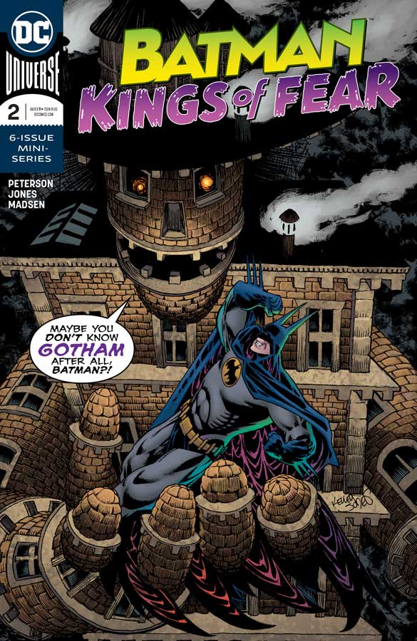
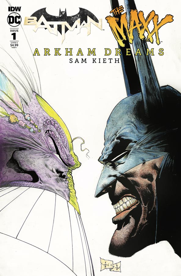
Batman: Kings of Fear #2
DC Comics Writer Scott Peterson, Artist Kelley Jones, Colorist Michelle Madsen, Letterer Rob Leigh
The fun continues with this dark and trippy Batman story that has him hallucinating ride that is a grand showcase for Jones’s artwork. Peterson wisely keeps the story simple and lets the visuals tell the story instead of weighing down the story with extraneous dialogue he lets the script deliver the visuals beats of the story and that is what is making this a fun little book. He does give the story a nice grounding elements that captures the darker tone of Gotham and the deeper psychology of Batman at the same time. What he does do is let Jones break loose and there are many times where the story is told visually that is where Peterson and Jones mesh so well together. Honestly Jones could draw the phone book and I would wait in line for it. There is a small handful of artists that you can say are definitive Batman artists and Jones is one of them hands down. What he brings to the Dark Knight is his own visual flair but also stands on the shoulders of those artists that have come before and has a great sense of history visually that he draws in every panel. He gets what and who Batman is and the sense of dark and deep scars of both the city and the man. With this story he is drawing nearly every villain that has ever been in Batman and that alone is the price of admission. He brings a great artistic perspective to the Scarecrow and the nightmares that ensue. While known for his deep and dark black inks it always impresses me how Madsen is able to bring a wealth of color to this dark world that Jones creates and is able to give great balance to it all with her spot on color choices that complement Jones artwork perfectly.
Is this book worth your time and money? I’ll be real honest here that this is not going to be the greatest Batman story that you have ever read but, what Peterson and Jones deliver here is a fun and wild ride that is enjoyable for what it is and doesn’t try to be more than that. I love it and it’s a nice fun read with gorgeous artwork that is sure to please. RECOMMENDED!
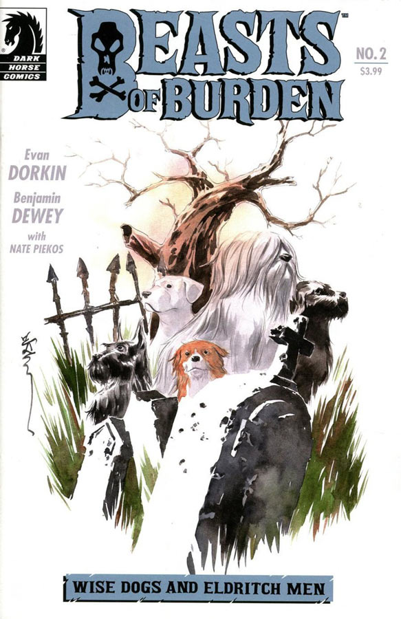
Beasts of Burden: Wise Dogs and Eldritch Men #2
Dark Horse Comics Writer Evan Dorkin, Artist Benjamin Dewey, Letterer Nate Piekos
This second outing of this mini series proves that the first issue was no fluke and this is another great story in the Beast of Burden mythology. What has always been this books strong suit over the years is a strong sense of story that makes it more impressive that the main cast are animals and that Dorkin is able to get so much emotion out of them is a testament to his writing skills. A good writer knows when to have dialogue and when to let the story breath with the artwork and Dorkin coming from a writer/artist background gets it and that’s what makes this book a real treat. While he may write the script it the paring with Dewey that is making this story work so well. The story and the artwork blend so well together and that is what is making this story so good. There is some really messed up things going on in this story and the mystery of the story has been one of its strongest assets. Dorkin is giving this story very ice pacing and giving it room to breath and that is a big win for this book. Dewey continues to impress with his artwork on the book and the way he is able to capture the emotions of the animals facial expression really blows me away. There are so many nice touches that he puts into ever panel that is a great testament to is artistic ability and makes for a really great looking comic.
Is this book worth your time and money? This second issue really seals the deal for buying this mini series. With it’s strong story and great artwork makes for a very enjoyable read with gorgeous artwork makes this book a big win. VERY RECOMMENDED!
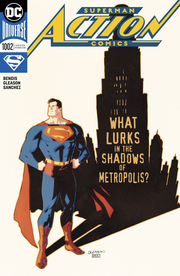
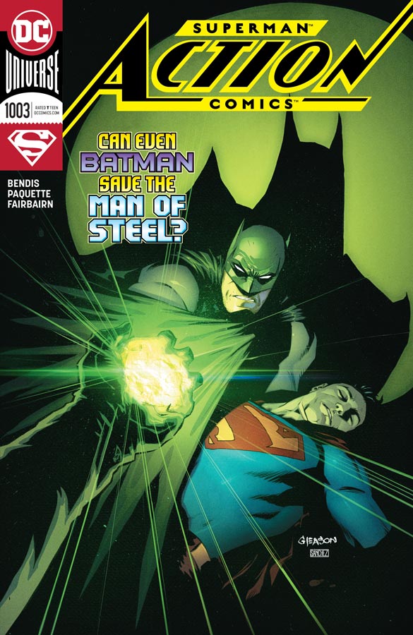
Action Comics #1002 & #1003
DC Comics Writer Brian Michael Bendis, Artist Patrick Gleason (1002) & Yanick Paquette (1003), Colorists Alejandro Sanchez (1002) & Nathan Fairbairn (1003), Letterer Josh Reed
Playing a little catch up here with Action Comics and Bendis’s take on the Man of Steel continues to delight and while I like his Superman story line, it’s Action Comics that I’m more charmed with. I thinks what is working so well here is that a good majority of the story centers around Clark Kent and the Daily Planet that is giving this story line a more relaxed feel and allows the supporting cast like Perry White to have stronger foundation and better character depth than other writers usually do. In #1002 the bar scene where Clark goes to get more information about the fires is simply priceless and shows why this story is working so well. In #1003 Bendis gets his first crack and Batman and delivers both the dark and the charm that he will sometimes have and blends him into the story quite well. Probably one of the best elements that he has delivered so far is the Superman taking his anger out in space about what is going on in Metropolis that gives him a stronger anchor in his human side than we have not seen very often. Gleason delivers some wonderful art in #1002 with the bar scene that really captures the tone of script so well and the emotions in the space anger scene is amazing. Paquette brings the good on his issue (#1003) with the Clark getting sick from Kryptonite and his spot on layouts for the sequence is where he really shines and he also draws a great Batman to boot.
Is this book worth your time and money? I’m really enjoying this storyline and I hope that Bendis continues to keep Action Comics in a more grounded feel because we rarely get to see that and it really shows what you can do with both Superman and more importantly Clark Kent that is often lost in the stories. Gleason and Paquette impress with their respective artwork and give the book a strong visual punch that really brings it home. I’m enjoying what Bendis is doing here and excited to see where he takes the story. Well worth getting and RECOMMENDED!





0 Comments