Tarzan on the Planet of the Apes #1
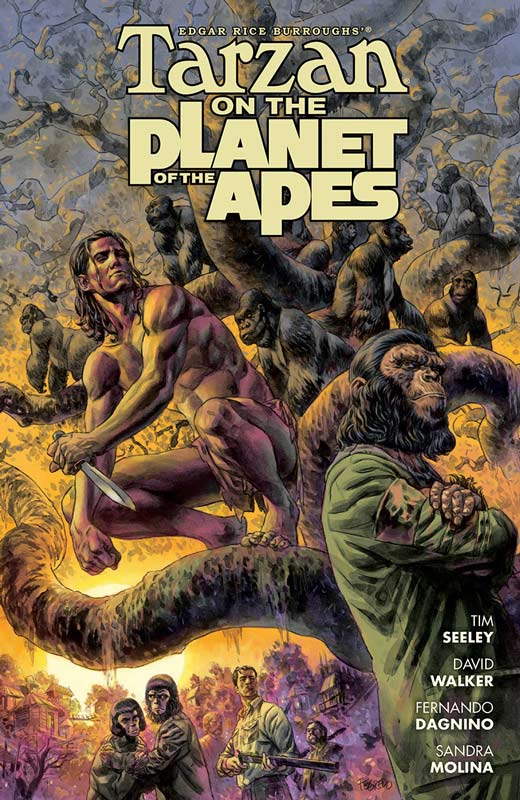
Dark Horse Comics/Boom! Studios Writers Tim Seeley and David Walker, Artist Fernando Dagnino, Colorist Sandra Molina, Letterer Nate Piekos
Company crossover books are more miss than hit so when they are announced you alway take them with a grain of salt and hope for the best. For a crossover book to work you need to have a strong creative team behind the book and a good reason for the characters to be together in the story. Seeley and Walker wisely hit the ground running with the script by dispensing with the usually dragged out reason for the crossover that bogs the first issue down. In this case they just get on with the story and pepper in the crossover aspect of the book. The mixing of Tarzan and The Planet of the Apes feels very natural here and you never feel while your reading it that it seems out-of-place. The other element that is low on the list of thing in a crossover book is getting a good artist. Most of the time the books simply rely on the popularity of the two properties to get readers to the book. Thankfully Dark Horse didn’t go that route here and Dagnino delivers some really outstanding artwork on the book. The detail that he put into the book is top-notch and never once skimps on any aspect of it from the backgrounds to the facial expressions.
Is this book worth your time and money. While my expectations were not super high on this crossover but the creative team really delivered a fun and exciting first issue that will have you coming back for more. This is one of the few crossovers that has a natural feel to it and meshed very well together. The real win for the book is Dagnino’s lush artwork that alone is worth buying the book for and getting a good story with it is a win for the book. RECOMMENDED!
Batman Beyond Rebirth #1
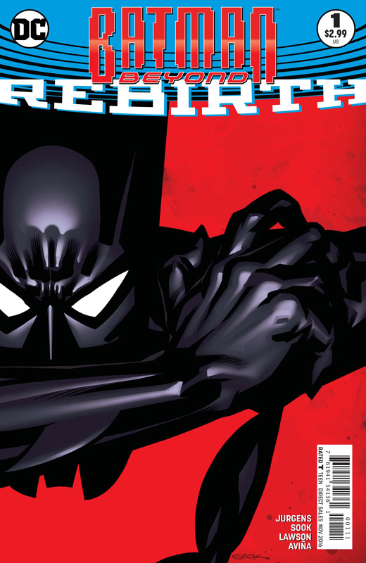
DC Comics Writer Dan Jurgens, Artist Ryan Sook, Colorists Jeremy Lawson and Tony Avina, Letterer Travis Lanham
While I enjoyed the animated Batman Beyond I was more of a Batman the Animated Series fan. As far as the comic book versions of Beyond none of them really blew any air up my skirt. While this new incarnation of the book didn’t blow me away, I did however find myself enjoying it more than the others. Jurgens writing here is considerably better than his Superman book that is stuck in the 1990’s but as with most of his books besides the original Booster Gold series to be an average writer. His script here is a pretty by the numbers affair and while it’s a fairly pleasant read it doesn’t really take any chances or give you a hugely compelling reason to come back for more. The shame with this book is that Sook is a fantastic artist and really makes this book pop visually. It’s such a shame that his wonderful artwork is kind of wasted on such an average story.
Is this book worth your time and money? While the book is not a train wreck it’s pretty average storytelling here and nice while your reading it but nothing memorable either. Sadly the high point of the book is Sook’s fantastic artwork that while it’s nearly worth buying the book for, can only save so much here. SKIP IT!
Frostbite #1
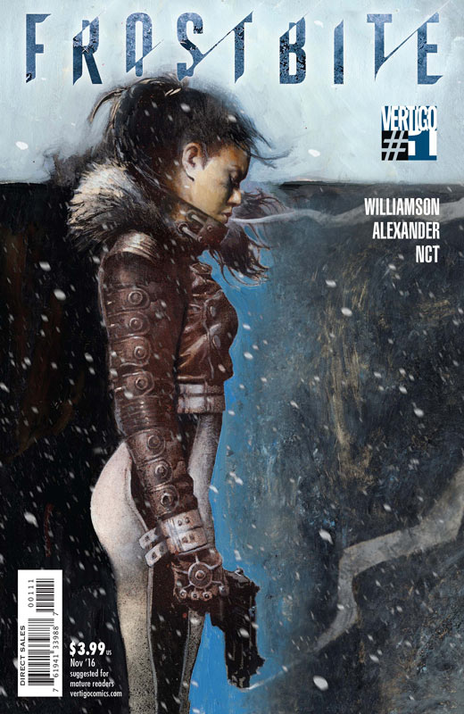
Vertigo Comics Writer Joshua Williamson, Artist Jason Shawn Alexander, Colorist Luis NCT, Letterer Steve Wands
While on the surface Williamson’s post apocalyptic story has a lot of familiar tropes in this first issue and while it may seem that way he gives the idea a nice refreshing spin that made for a very good read. While this first issue is heavy on the exposition Williamson keeps the pace of the story moving along nicely and gives the book a good set up to the story. The key for the book is going to be the next issue to see if Williamson will take the story is a different and unexpected direction. What really makes this book click is Alexander’s artwork that really delivers the goods visually to the story. The one thing that I am a big stickler for is backgrounds but I have to hand it to him for using the bleak snow motif in the visual favor of the background that gave the book a creepy feeling. He did a great job of capturing both the scope and the subtle intimate story elements in the artwork.
Is this book worth your time and money? I was quite surprised by this book and while it has to be careful not to fall in the been there and done that with the story, I think that Williamson and Alexander have infused some new twist into a familiar story here. If they continue the momentum of this first issue then it looks to be a very good ride. RECOMMENDED!
Backstagers #2
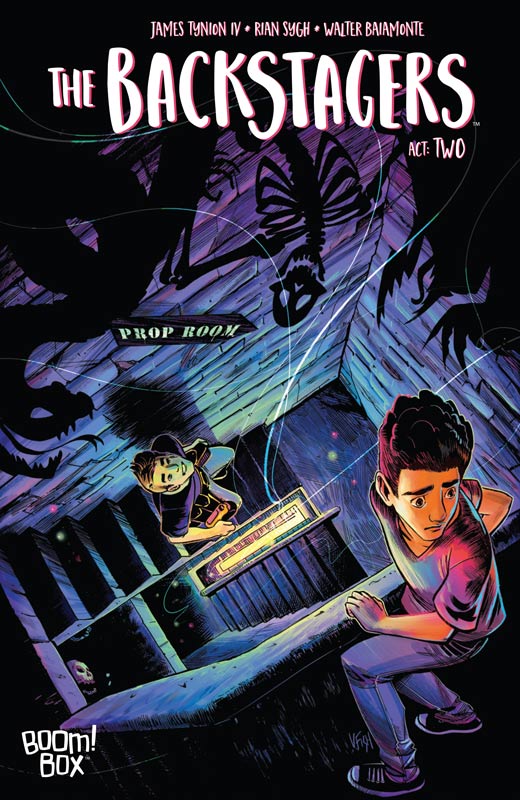
Boom! Box Writer James Tynion IV, Artist Rian Sygh, Colorist Walter Baiamonre, Letterer Jim Campbell
I was not overwhelmed by the first issue of this series but the book did have a nice spark of an idea and had some good ideas. While the second issue was a big improvement it still seemed to be missing a spark that made it work. While the first issue script was a bit scattered the second issue is more straight forward and I found it to work better. There were a few times where the book got bogged down with too much dialog and became a bit boring. I found Sygh’s artwork to still be a little mixed but when they were in the maze of rooms he did a very nice job of balancing the dark and light tones of the story very nicely.
Is this book worth your time and money? I really want to like this book more than I do but it is just falling short of the mark. While I think that the book works well for a younger audience it’s just missing something for me. Tynion and Sygh put together a good idea but it never quite falls into place. Not a bad book by any means but not enough for me to keep going with it.
Josie and the Pussycats #1
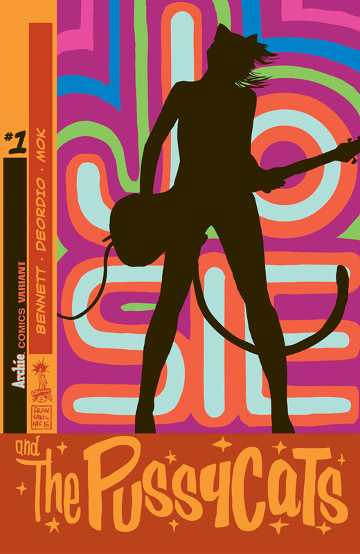
Archie Comics Writers Marguerite Bennett and Cameron Deordio, Artist Audrey Mok, Colorist Andre Szymanowicz, Letterer Jack Morelli
Well Archie was batting a 1000 on their revamping of the Archie line but sadly Josie and the Pussycats ends their winning streak. The story by Bennett and Deordio is where the book falls short. The problem isn’t that it’s not good but ends up being an average and uninspired read that doesn’t offer anything new or exciting. The script is very by the numbers and while there were a few good ideas here and there it just didn’t carry much weight to it. Mok’s artwork does look nice there were a few inconsistent moments that I noticed. She does give the book a nice feel and tone with her artwork that did help the story along.
Is this book worth your time and money? While I will give the book a few more issues for nostalgia sake I was very disappointed by this first issue. There was nothing that you didn’t see coming in the story and Bennett and Deordio didn’t give the story a fresh spin that Archie, Jughead or Betty and Veronica did previously. The book was simply too safe and boring. I hope that maybe once we get past this issue that will change but the book is on extremely thin ice here.
Teen Titans Rebirth #1
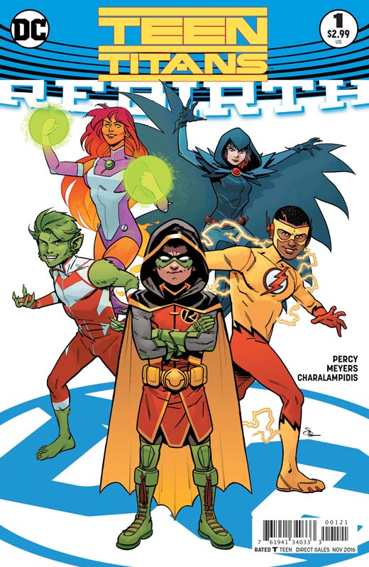
DC Comics Writer Ben Percy, Artist Jonboy Meyers, Colorist Jim Charalampidis, Letterer Corey Breen,
I am a huge fan of Wolfman and Perez’s New Teen Titans and while there have been many attempts since their run no creative team has come close to their run. I will give Percy and Meyers that they get this new series off to a decent start but I can shake the feeling that the plot of the story has been done in the Wolfman and Perez run of the book. While the basic plot of the story is not very original I will give Percy credit for getting the tone and feel of the characters right. This first issue is all set up so there is very little meat on the bone to see where they are going to take the book. On the plus side Meyers gives the book a great visual look that keep the book moving along nicely. He has a nice art style that really suits the book and gives it a nice boost.
Is this book worth your time and money? This first issue doesn’t get the book off to the best start and didn’t get me excited to read beyond this first issue. It was a by the numbers story that threw a lot of things at you but nothing really stuck to make it interesting. The best thing about the book is Meyers artwork that was quite nice but ultimately can’t save an average story.
Wonder Woman #7
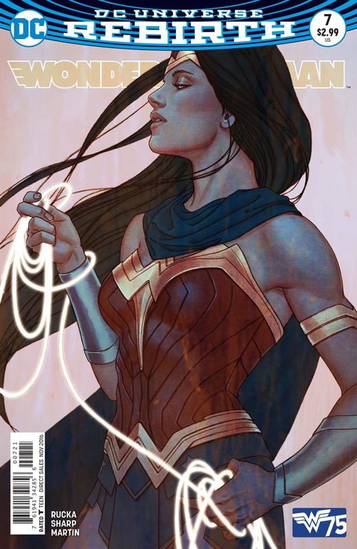
DC Comics Writer Greg Rucka, Artist Liam Sharp, Colorist Laura Martin, Letterer Jodi Wynne
The first act of the story by Rucka and Sharp comes to a very nice spot at this point and is a great set up to the next act. What has made this modern story so great is that Rucka is not only setting up his story of Wonder Woman but setting the stage with the supporting cast but more importantly the tone that the book is going for. What is making the book so great is the thought and depth to the story that makes it such a great read. You can feel every beat of the emotions and action of the story and makes every turn of the page exciting and satisfying. If there is a minor criticism is that the defeat Cadulo and Urzkartaga is a bit too quick and didn’t quite have the impact I would have liked but it’s a very minor quibble in an otherwise great story. What is making this book work so well is the synergy of Rucka script and the artwork of Sharp. This is where the book is really shining when you have the writer and the artist working as a well oiled machine. Sharp’s visuals is like finishing Rucka’s sentences of the same conversation. It’s rare when you have a creative team that really bring a book to life-like this.
Is this book worth your time and money? Wonder Woman has alway taken a back seat to both Superman and Batman and while there are some very good book with them going now it’s this Wonder Woman series that is the top of the Trinity at DC now. Rucka and Sharp are delivering a book that not only satisfies but is truly exceeding expectations. Honestly few superhero books in recent memory have simply been this good and shows that when you give a book to a creative team that truly cares and respects the character then you can have a superhero book that is worthy of the legend. HIGHEST RECOMMENDATION!


0 Comments