A busy week at the 9 to 5 gig has cut down this weeks reviews to a smaller batch to get to this week. I was also planning to get the Dave Gibbons panel from Long Beach Comic Con up this week but will get it up for sure next week. So let’s get to the comic book reviews
Dastardly & Muttley #1
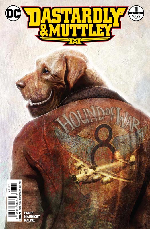
DC Comics Writer Garth Ennis, Artist Mauricet, Colorist John Kalisz, Letterer Rob Steen
The second wave of Hanna-Barbera inspired books lands and while Wacky Raceland was not as well received as the others (I was a fan of the book because it really went all out there with the concept), I was a bit surprised with the announcement of this mini series. I am a huge fan of the original animated series and was excited to see that Ennis was writing this book. This first issue is a pure exposition that sets up a lot to unfold over the course of the story and some readers might struggle with that. Ennis tends to start a story with a lot of detail that on the surface may seem slow but it’s the way that he sets things up for the payoff of the overall story that you have to go with in all of his books. With the wild nature of the premiss I really enjoyed the way that he unfolded the story here and his very weird and wild take on the characters. Where the book really shines is his mixing of the real world then throwing in a lot of cartoon tropes and fuses them in a way that keeps the story interesting while setting things up. Sure the story is a slow build but with five more issues there is a good reason to take your time setting things up here. Mauricet does a really nice job on the artwork on the book. He is able to run that fine line between realistic and cartoony styles very nicely here. The story gets pretty wild here and he is able to handle the shifts quite well here. Considering what Ennis threw at him in this first issue I can’t wait to see how he handles things with the art over the course of the series.
Is this book worth your time and money? If you are willing to go with Ennis’s unfolding the story with a set up first issue then I think you will find this book to be a nice little treat. The way that he blended it all together was nicely done and there is a lots of promise here that I liked. Mauricet really delivers the goods with the artwork on the book and if you’re a fan of the original characters then I think that you should definitely give the book a try. If you’re looking for something truly different then you have come to the right place. RECOMMENDED
Kingsman: The Red Diamond #1
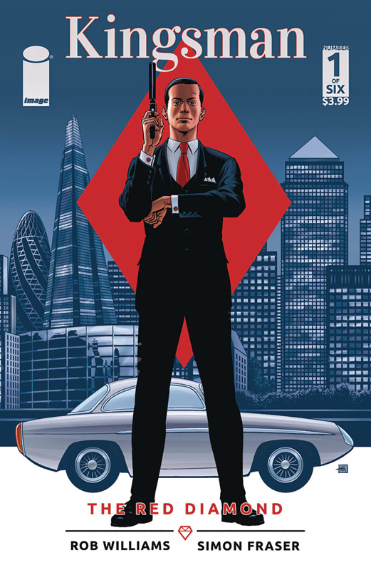
Image Comics Writer Rob Williams, Artist Simon Fraser, Colorist Gary Caldwell, Letterer Peter Doherty
As a fan of the original series by Millar and Gibbons and a big fan of the movie based on it, I was looking forward to this series that seems to take place between the first and second film story. Williams has written some really good stories but this book just never quite took off for me. The big problem is that there was nothing in the script that really stood out. It felt like a very by the numbers affair here and there really wasn’t much excitement or for that matter new here. There was nothing in the story that you don’t see coming and that is where it’s a letdown. Now the script is not bad but pretty pedestrian and didn’t really bring anything new or exciting to the world. Where the book really falls apart is with Fraser’s artwork. One of the biggest problems with it was that it was very inconsistent throughout the book. His art is pretty stiff here and is a real letdown for the book with such a strong pedigree with the original series.
Is this book worth your time and money? While not the worst book I have ever read, the quality of the story and art were way below average here. With its simple and unoriginal story and artwork that is on par with an average Dynamite book was pretty much a waste of time. There is little to compel a reader to bother reading the rest of the story with this weak set up. SKIP IT!
Lark’s Killer #2
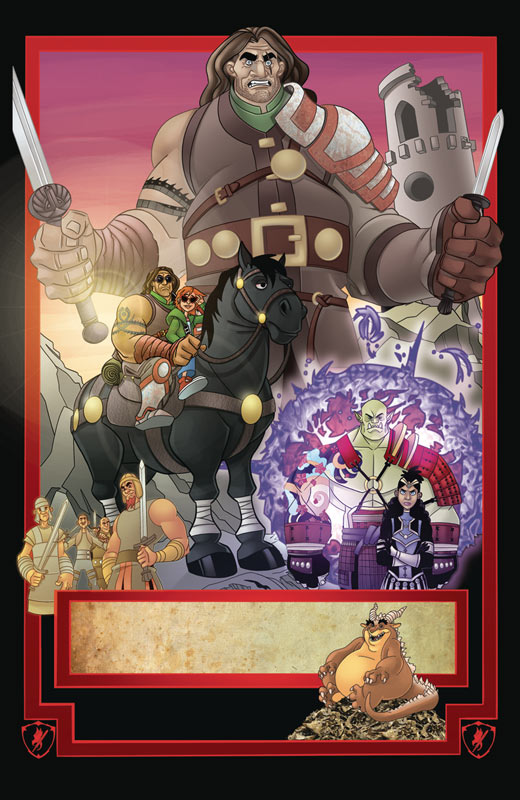
Devil’s Due/1First Comics Writer Bill Willingham, Artist Mark Dos Santos, Colorist Salvatore Aiala, Letter Thomas Mauer
I enjoyed the first issue of this book and Willingham does a good job of building upon it here in the second issue. There is still a lot of world building and exposition but he keeps things moving along where you don’t get board or lost with all of the set up elements. Where the book really shines is with the character development that is always a strong Willingham trait that really works well here. Sure there are a lot of familiar tropes that he uses in the book but as always seems to find a way to make it fresh and interesting. One the best things going for the story is the Hope and Crosby story elements with Lark and Brenar that adds a really nice touch and charm to the story and even though it’s fantasy based he makes sure to keep a strong humor element in the book. Dos Santos artwork continues to impress with his style that gives the book a nice cross between a storybook and an animated film. Where he really nails the art is with the character expressions that really shine through on with the artwork. This is a good-looking book and as an added bonus there is a backup prose story by Willingham with his artwork that was a very nice addition to the book.
Is this book worth your time and money? Willingham has set a pretty high bar for himself but Lark’s Killer is turning out to be as good as I had hoped and is on the road to possibly exceed them. He is taking his time in building both the world and the characters that is coming along at a nice pace. Dos Santos is giving this book the visual spark to make it all come together very nicely and Aiala’s color work complements the line work wonderfully too. If you looking for a solid fantasy comic then you should look no further because Willingham and Dos Santos are delivering the goods here. RECOMMENDED!
Scales & Scoundrels #1
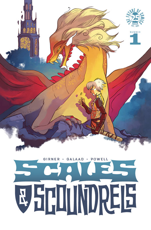
Image Comics Writer Sebastian Girner, Artist Galadd, Letterer Jeff Powell
What Scales & Scoundrels may lack in originality is more than made up in charm and fun. Girner story while familiar does keep it light and breezy with the set up in this first issue. He does a good job of setting both the world and the characters up, and while it’s a story you have read many times before he tries to give it a new spin here and there. Girner does a good job on the pacing in this first issue and balances the exposition well so it never feels bogged down. The only downside that I see here is where Girner takes the book because you can get away with the familiar tropes that the first issue has but it will need to chart a course with more original ideas to succeed in the long run. Galaad’s artwork is a perfect fit for the tone of the story. He has a nice style that is a mishmash of many influences but manages to make it original and fresh. He does a very nice job on the visual pacing of the book and makes sure that every panel is filled with great detail and very nice backgrounds. His color work here is very good with a nice storybook feel that gives the book a nice visual boost to his line artwork.
Is this book worth your time and money? I enjoyed the first issue very much and I hope that Girner and Galadd are able to take the story in a direction that will be a bit more original than this first issue. That is not a knock against the book but while I had a lot of fun with this first issue, it didn’t necessarily bring anything super new to the table and I hope that they will surprise me in the next issue. This is a fun little book that has a lot of potential and is well worth giving the book a try. RECOMMENDED!
Doom Patrol #8
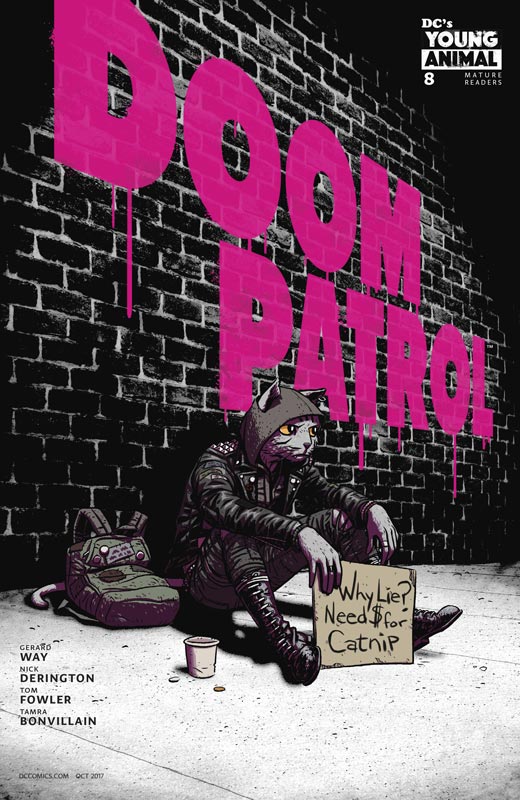
DC’s Young Animal Writer Gerard Way, Penciller Nick Derington, Inker Tom Fowler, Colorist Tamra Bonvillain, Letterer Todd Klein
Embarking on its second story arc the book is starting to find a nice level for the book. The first story arc was good, it was almost a little too ambitious for its own good. Way is starting to find his voice on the book and breaking away from the Grant Morrison shadow that was a bit to evident in the first six issues. The one thing that the book struggles with a bit is that it’s still feels like it’s still being set up. Way still is unloading exposition that I would have hoped that he would have done by now. It’s not that the story is slow but he seems to not moving forward as much as I would have liked by this time. The one thing that the book does very well is have a great sense of family that has always been a hallmark of the Doom Patrol. Way does a nice spin here and shows that families don’t always get along perfectly and that there are ups and downs but will come together when needed. I will give him that there are some good ideas in this issue that are giving the book a better footing to the overall story. Derington artwork is a huge win for this book. He brings such a subtle touch to the artwork that delivers the emotions of the characters perfectly. There is a lot going on in the story but Derington gives the reader a great visual guide to keeps your focus on the key elements of it.
Is this book worth your time and money? I like this book but just at the edge of loving it. I will give Way that he is starting to find his voice on the book but he needs to give it a bit better focus and move the story along a tad better. It’s not a knock on the book but or his writing but it’s so close to being a great book that it could be. Derington continues to deliver simply gorgeous artwork that is reason enough to get the book. I would have liked this second story arc to be a better jumping on point for new readers but I understand why he is taking this direction with it. I still find the book to be a good read I am hoping that Way is able to make it a must read because he is so close to it.




0 Comments