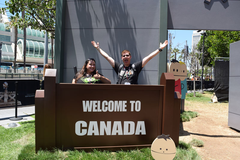
With San Diego Comic Con behind us I will try to catch up with the last two weeks of new comic books so I will try to keep them short so we can get through as many as possible.
Red Hood and the Outlaws Rebirth #1
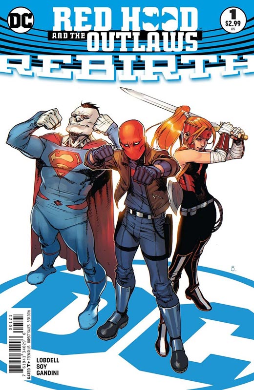
DC Comics Writer Scott Lobdell, Artist Dexter Soy, Colorist Veronica Gandini, Letterer Taylor Esposito
While I get that Batman is DC go to character and there are more comics based on his stories I found that Red Hood and the Outlaws is one that while not bad falls into the very middle of the road title that after reading the story I found it to be pretty forgettable. Lobdell is a writer that for me tends to run more cold than hot with his writing. His script does hit all of the right beats for a first issue but that is where some of the problems are. The story feels likes it’s just going through the motions and doesn’t give the reader much to invest in. I found that the Jason Todd character is not particularly likable and the whole good guy playing bad and then going undercover to infiltrate the bad guys is a worn out story trope and Lobdell doesn’t really add anything new to it either. The artwork by Soy is good but feels a bit like a Jim Lee clone and the lack of backgrounds is far to noticeable throughout. His art is nice but nothing that got me very excited visually.
Is this book worth your time and money? This is one of those new titles that I really doubt will last past 12 issues. The story just sits there and is not very compelling and while the art is nice it does not stand out visually from the average. Overall the book is a middling effort and with so many other Batman related titles you can pretty much just SKIP THIS ONE.
Wonder Woman #3
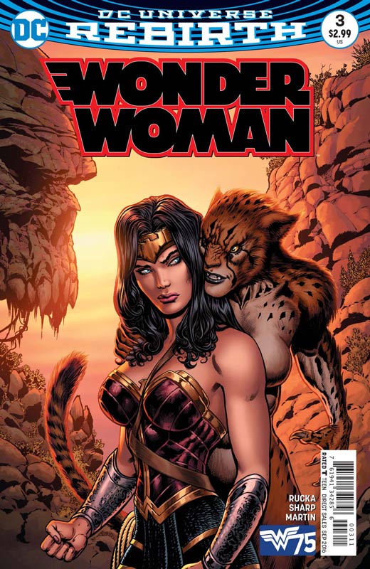
DC Comics Writer Greg Rucka, Artist Liam Sharp, Colorist Laura Martin, Letterer Jodi Wynne
One of the strongest Rebirth launch titles continues to impress with the second issue of the present day storyline with the alternating of the origin story. The first part got the book off to a great start and this second issue really solidifies the great direction of the book. Rucka is doing a great job with the story that is doing a great job of being refreshing but not forgetting the past that made Wonder Woman such a great character. His take on Cheetah and the nice pacing of the story are just right. While some will have an issue with the pacing and the B storyline with Steve Trevor I actually find it quite refreshing that Rucka is willing to give a mainstream super heroine a more indy comic feel that I for one am really liking. Sharp continues to impress with his lush and detailed artwork to the book. Few artist are able to capture the more subtle dramatic moments in comics today but Rucka was wise to choose him for the book. This is one of those rare books that has a perfect balance between the story and the art that is a sheer delight to read.
Is this book worth your time and money? While Batman and Superman always seem to get the glory, it’s very nice that on her 75th anniversary that Wonder Woman has risen to the top of her game and has become a must read book in the DC Rebirth line. Rucka and Sharp (along with Scott) are delivering books that are must read and capture the essence of what a great character Wonder Woman is. HIGHLY RECOMMENDED!
Batgirl Rebirth #1
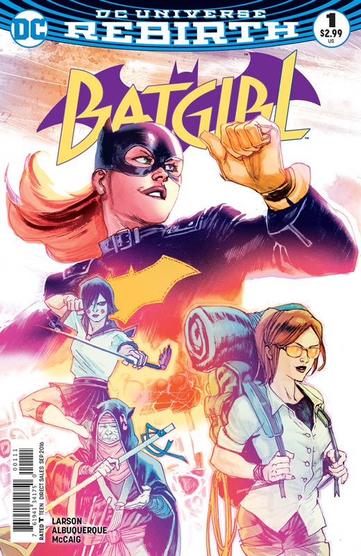
DC Comics Writer Hope Larson, Artist Rafael Albuquerque, Colorist Dave McCaig, Letterer Deron Bennett
The revamped Batgirl from Brenden Fletcher, Cameron Stewart and Babs Tarr was one of the books that lead to the rebirth line of books. It sparked a new wave of mainstream comics at DC and brought new and old readers back to a character that had its ups and downs over the years. Now this new book spins out of the events of the previous series but is very new reader friendly and builds on the great elements from the previous series. Larson who is writing the wonderful all ages book Goldie Vance over at BOOM! now starts the first issue off with a solid script and she wisely keeps the fun elements from the previous series thankfully in-tacked. She does a great job of laying groundwork for the story elements that set up the series. One thing that really impressed me was the ease that she managed with the exposition of setting up the ongoing story elements. The story was a real pleasure to read. Getting Albuquerque on the artwork was the real icing on the cake for this new series. His art style really brings a light and fresh tone to match the story. It has a great old school feeling to the book that reminds me of artist like Jim Aparo who was one of the definitive Batman artist. While Albuquerque’s style is his own he gives the book a great richness and warmth that this book is very lucky to have.
Is this book worth your time and money? If you were a fan of the previous run of Batgirl then you will feel right and home with this new book. For new readers this is a great jumping on point and a great read that is a great start to a new chapter in the Batgirl mythology. This one is a winner! VERY RECOMMENDED!
Captain Kid #1
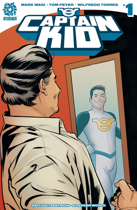
AfterShock Comics Writer Mark Waid & Tom Peyer, Artist Wilfredo Torres, Colorist Kelly Fitzpatrick, Letter A Larger World
I’m usually a big Waid fan but while I really wanted to like this book it really seemed to be all over the place and lacked real focus with the story. It’s a real shame because there are some good ideas here but ultimately there is no real payoff to the story. Waid and Peyer introduce a lot of characters but none of them really grasp the reader to care about them or whats going on. One of the biggest problems is that your never really sure what is going on. You feel like you have come into the middle of the story and are not quite sure what to make of it. It’s not that it’s unreadable but the script is disjointed and I tended to feel lost and bored by the book. Torres artwork is good but doesn’t grab you or overall impress. It does the job but never really gets you to invest in the story with its visuals.
Is this book worth your time and money? I think deep down there is a good book here but you would be hard pressed to see that with this first issue. I think that the book just misses the mark by trying to hard to keep the mystery of the plot but in doing so they leave the reader clueless to care about the story. SKIP IT!
Adventure Time Comics #1
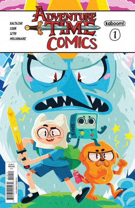
kaboom! Writer and Artist Art Baltazar, Katie Cooke, Tony Millionaire and Kat Leyh
kaboom! finally has decided to publish a comic with just short stories that are similar to the back up ones in the regular book. The first issue starts off with some amazing talent and some fun little stories. There are thankfully no misses in this first issue but I would have to give Cooke the edge for her story “Stand Next To Me” as my favorite. Overall the comic is a short but very sweet read for both young and old and a real treat for Adventure Time fans. It also allows creators like Millionaire to do a very off the wall story by even Adventure Time standards.
Is this book worth your time and money? This is one of those books that is made for Adventure Time fans and comic fans that are looking for more indy creators doing stories outside their creator owned material. This is a fun all ages book that will satisfy both.
Predator VS Judge Dredd VS Aliens #1

Dark Horse/IDW Writer John Layman, Artist Chris Mooneyham, Colorist Michael Atiyeh, Letterer Michael Heisler
One of the more odder crossovers but in a really weird way kind of makes total sense. Layman does a nice job of setting up the story in this first issue that blends the three franchises together quite nicely. He also matches the feel and tone of the characters so that it makes sense and has a natural feeling to it. The key is that Layman concept of how they all end up together works quite well and gives the readers a reason to want to come back for the second issue. While the first issue is pure exposition it never drags or is boring because he keeps the story moving along at a nice pace. Mooneyham’s artwork has a nice gritty style that is predominately in the Dredd universe style that fits the story well.
Is this book worth your time and money? While the book doesn’t blow you away it does however do a nice job of bringing the three franchises together in a believable story that is fun and does what a crossover should do. Give the book a good story and nice art and have fun with it. This one does that nicely.
ROM #1
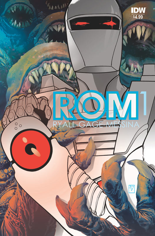
IDW Writers Christos Gage & Chris Ryall, Penciller and Colorist David Messina, Inker Michele Pasta, Letterer Shawn Lee
As a kid I was fortunate enough to own on of the ROM action figures. He was awesome because of the LED lights and the sounds that he made. Marvel Comic developed a comic based on the toy that lasted 75 issue with 4 annuals and outlasted the toy that flopped for Parker Brothers. Now ROM is back from IDW and sadly gets off to a very rocky start. IDW wisely reprints the Free Comic Book Day #0 issue as a Prolog in the first issue for readers that might have missed it. While the story by Ryall and Gage is not bad but it’s not very compelling either. The biggest problem is that the story structure is very basic and cliché that there is nothing that really keeps your interest while your reading it. You go through the motions of reading it but you never care about the characters or the premiss of it. The artwork by Messina and Pasta is very stiff and flat. It’s not bad but it never really captures the action very well and while there are times where it almost gets there it ends up being OK visually but never really excels overall.
Is this book worth your time and money? Sadly IDW revival of ROM like The Micronauts is a miss. While I have nostalgia for the toy and the original Marvel series, this book simple is not very good on its own. With a cliché story and so-so artwork reading this book was simply disappointing and sad. SKIP IT!
Future Quest #3
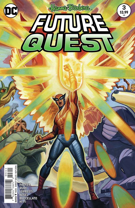
DC Comics Writer Jeff Parker, Artists Steve Rude and Penciller Aaron Lopresti and Inker Karl Kesel, Colorists Steve Buccellato & Hi-Fi, Letterer Dave Lanphear
This third issue of my favorite Hanna-Barbera title so far continues to bring back the classic superhero characters into one big comic that hits another high mark. This issue is both side stories but have a huge impact on the main story at the same time. While there have been fill in artist on both the second and this third issue, having Rude draw Hanna-Barbera superheroes is always a high point and is always welcome in this title. The first half of the book is a Birdman story that leads into the events in the first issue and give more back story on Birdman and how he is involved with the story. Parker wisely writes the story not only to fit into the continuity of the book but knows what Rude brings to the book and tailors the story to let him draw the story and boy does Rude bring his A+ game to this book. Any book with Rude artwork is a treat but having him work on this book is simply a dream come true. The second story with the Herculoids not only also ties into the first issue but Parker gives them a very impressive origin story that gives a great and fascinating back story that was never in the original series. Parker is really nailing this book with these new elements that are adding such a rich and lush story that this issues side story make this book all that more impressive. Lopresti and Kesel give the story fantastic artwork that really enhances the epic scope of Parker’s story. They do some fantastic action scenes but deliver great emotional impact to the dramatic origin story.
Is this book worth your time and money? I simply can’t praise this book enough. It takes a bold writer to have the third issue of the comic tell back story that leads to the events of the first issue and Parker not only does that but does it so effortlessly that your truly entertained and then even more excited to see where he is going to take the story next. I hope that there are more of these types of issues in the future because they add such an amazing richness to the overall book that is simply brilliant. Having Rude and Lopresti and Kesel to bring these story to visual life is the real gift of this third issue. This book is not only a dream come true but they have even gone beyond my wildest expectation for this book. Simply put this book shows how to breath new life into beloved characters and yet treat the original source material with respect and care. HIGHEST RECOMMENDATION!
Betty & Veronica #1
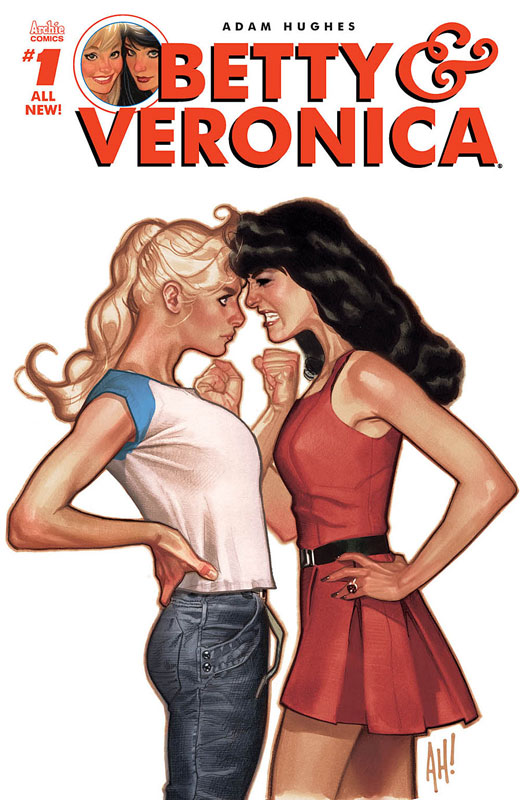
Archie Comics Writer and Artist Adam Hughes, Colorist Jose Villarrubia, Letterer Jack Morelli
When Adam Hughes draws a book its alway a cause for celebration but when it was announced that he was going to do a Betty & Veronica book for Archie it was both shocking and extremely exciting. While it may not have lived up to the hype for some readers, I found it to be a good companion book to the new Archie and Jughead comics. While Hughes is a stronger artist than writer he does craft a pretty cleaver story that sets up the story arc nicely for a first issue. The one thing that he really gets right is the tone of the story and he keeps the spirit of what we love about Betty and Veronica. While the story is simple I found it to be a fun read and there is a lot of tongue in cheek here. Hughes went in a very quirky story style with this book and that is going be somewhat decisive for some readers. He does assume that you know the cast of the book and there is very little exposition in the story. While Hughes is known for his cheesecake female art, in this book he keep the tone and visuals very grounded in the Archie mythology and tone. While Betty and Veronica are very voluptuous he keeps them more in the visuals of the girl next door mode. There is no doubt that this is the best looking of the new Archie titles and that alone is worth buying the book.
Is this book worth your time and money? While I’m a little late in reviewing this book, I found some of the other sites reviews a bit baffling. While I will admit that this book is not high art and the story is goofy and odd at times but the thing that I liked is that it still feels like a classic Archie book. While everyone with bring high expectations to this book because of Hughes, I think that a lot of the reviews are really over thinking this book and while I’m not giving a pass to the book, I do think that if you go into the book with an open mind you will have a fun time with it like I did. I recommend the book.
Black Hammer #1
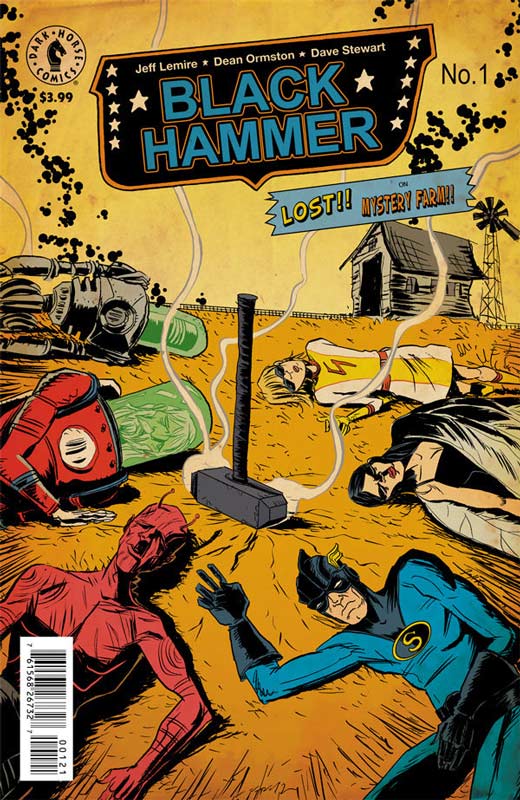
Dark Horse Comics Writer Jeff Lemire, Artist Dean Ormston, Colorist Dave Stewart, Letterer Todd Klein
I went into this book with little expectations and was simply blown away by how good it was. Lemire does a great job of not only setting up the premise of the story but never lets the exposition get in the way of the reader enjoying the story. While there is very little revealed in this first issue, Lemire does one thing perfectly and that is give a great introduction to each of the main characters so that the reader can care about them and keep them interested in reading more about them. So many writer fail miserably with this and Lemire does it with such ease that makes this a very strong first issue. Lemire has a cleaver way of weaving the story and drawing the reader into the world and simple going with every element no matter how weird it gets. Ormston delivers some really wonderful artwork here. His style is perfectly suited for the story and he really brings this world to life. He also brings a great tone and feel to Lemire’s script and the facial expressions that really conveys the dramatic story elements perfectly.
Is this book worth your time and money? This is one of those comics that really sneaks up on you and by the end of the first issue you will be totally hook on it. Lemire and Ormston have crafted a story that leaves you wanting to see how the layers of story are going to play out. This is one mystery that I will stick around to find out what is going to happen. HIGHEST RECOMMENDATION!
Snotgirl #1
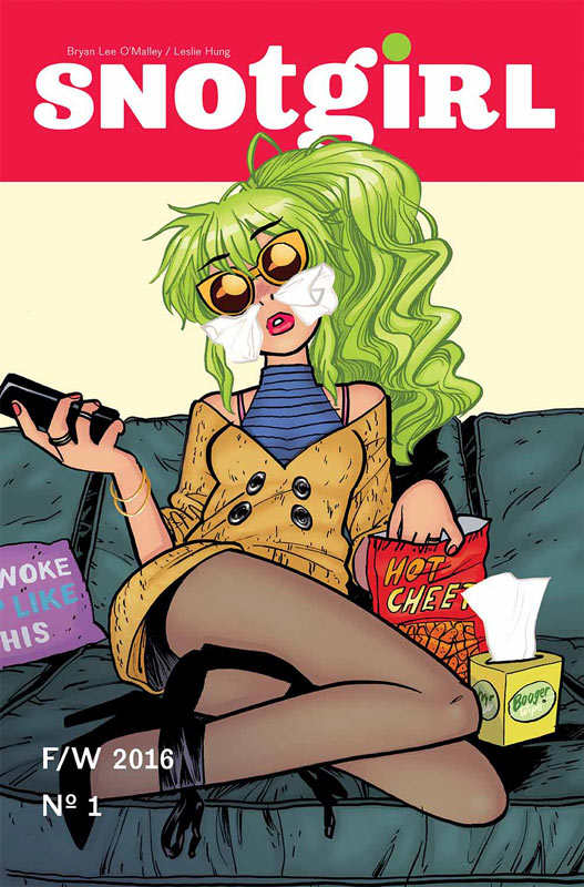
Image Comics Writer Brian Lee O’Malley, Artist Leslie Hung, Colorist Micky Quinn, Letterer Mare Odomo
This is a book that is a real head scratcher for me. I’m a huge fan of O’Malley but this book simply is not very good. I seem to be in the minority on this because there is a lot of praise for this book but I found it very boring, pretentious and could care less about any of he characters. I always wonder if I’m just the crazy one when everyone else loves a book and I found the book to have no depth to it and overall had no real point. Look I get the whole social media point of the story but none of the characters have a point they just aimless wander around in the story. O’Malley never gave me anything in the characters to care about and seem to have no point beyond having a high social media profile. The book seems to be about so-called fame of an internet star but that is for me where the flaw of the story is. You have people who are famous for being say a YouTube star and while they may have a lot of followers they ultimately are no different from say the Kardashians. Hung’s art is nice but there is a lot of times where there is just a huge lack of detail and barely any backgrounds the majority of the time. But I will give her credit that her style fits perfectly to O’Malley’s story.
Is this book worth your time and money. For me this book really missed the mark and for me the biggest flaw is that it really has no point. Every element of the story is as superficial as the main character. SKIP IT!
Scooby Apocalypse #3
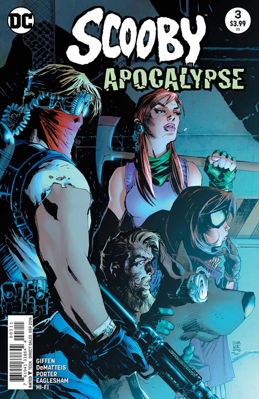
DC Comics Writers Keith Giffen and J.M. Dematteis, Artist Howard Porter & Dale Eaglesham, Colorist Hi-Fi, Letterer Nick Napolitano
I am happy to say that Scooby Apocalypse is finally hitting it’s stride with this third issue. I had said with my review of the first issue that the story was going to be a bit of a slow burn and the story elements are starting to come together. While there is still more mystery ahead we are starting to see some nice humor elements come into play that is finally nice to see. I get that it’s an edgier take on Scooby Doo but the book needed to have at the very least some dark humor. Giffen and Dematteis are still throwing out a lot of exposition but with this issue it’s starting to wind down and are starting to get more classic Scooby character elements in the book like the fun part that was missing. The story is starting to pace out better with this issue and while it is not the strongest of the Hanna-Barbera titles it is starting to come into its own finally. Porter and Eaglesham simply have saved this book visually and this issue is no exception. It appears that Porter handles the present story while Eaglesham does the flashbacks. Either way the book still is visually strong and the scripts are finally catching up to the great visuals in the book.
Is this book worth your time and money. I think the thing with Scooby Apocalypse is that it’s going to work better in one reading compared to a monthly comic. While I can handle the pacing of the story some readers may not but overall I’m still intrigued with the book and enjoying the different take on the Scooby Gang.
The Hellblazer Rebirth #1
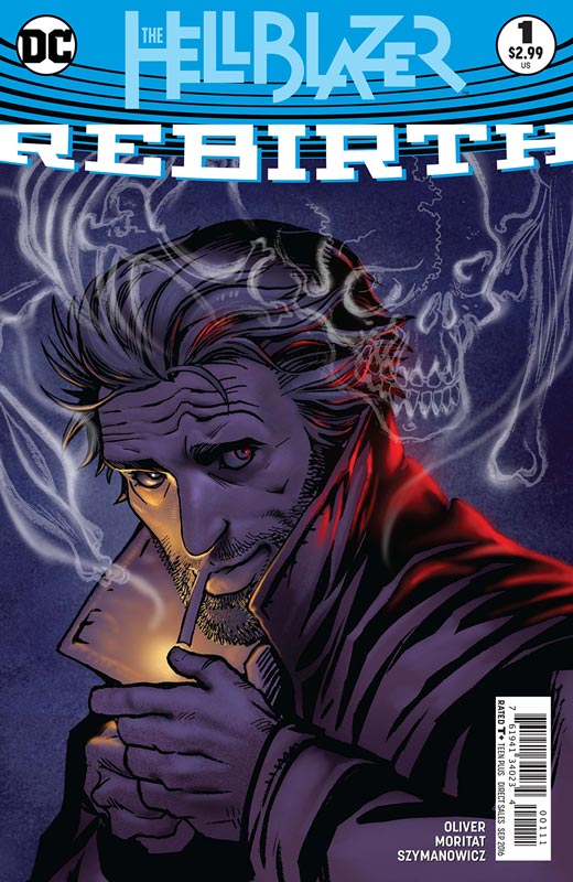
DC Comics Writer Simon Oliver, Artist Moritat, Colorist Andre Szymanowicz, Letterer Sal Cipriano
This one is going to be a quick one. This first issue of Hellblazer or simply John Constantine is a story for new readers that is a simple story that will give readers a primer of who John is and what he can do. Oliver does a nice job on a simple story that hits all of the basic beats that it needs to do. Moritat does an exceptional artwork for the book and is very well suited for the series.
Is the book worth your time and money? For more seasoned Constantine readers this issue is a filler for us until the second issue. This issue is really a #0 issue with a #1 on the cover. The second issue will be the one that will make or break this book.
Batgirl and the Birds of Prey Rebirth #1
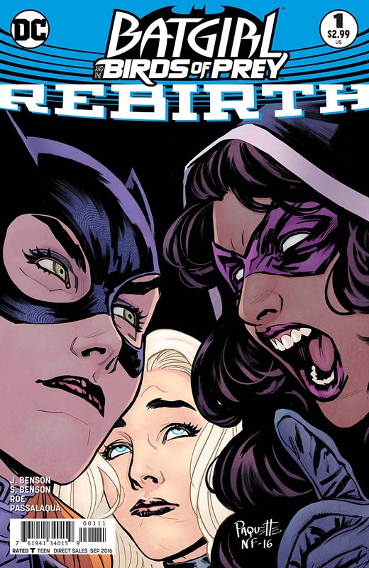
DC Comics Writers Julie Benson & Shawna Benson, Artist Claire Roe, Colorist Allen Passalaqua, Letterer Steve Wands
Another #1 Rebirth title that is really a #0. The story by Benson & Benson is a greatest hits story that is basically for new readers and they do a nice job of getting them up to speed with the characters The story is pretty basic with some story arc elements but overall the book ends up being a so-so read but with the set up and exposition it’s hard to get excited and I don’t blame the writers because they are making sure that new readers are brought up to speed. Roe’s artwork is good but a little inconsistent at times this happens with new talent on a company book. Overall her art is nice and hoping that she is able to find a good working groove on the book. When she’s good it really good.
Is this book worth your time and money? This is off to a shaky start and the next issue is going to be a make or break it for this title. It feels like DC is forcing this title because of the female centric book that is needed for diversity I just hope that the creative team can give the book a voice and not end up being a filler book.


0 Comments