
I’m trying to get back into the swing of things at the website and trying to get more regular post up. I’m going to try out this new idea that will take a comic book cover that in a single image sum up the issue in a way that hits the bullseye. Back in the day of paperback books publisher discovered that if you put a really well drawn cover on a mediocre book you could sell a lot more than if it was relying on the content of the book itself. A good example is the Frank Frazetta painted covers for many fantasy novel and of course most famously the Conan novels.
Comic book publishers would also learn this theory and even today we see comics with multiple covers that sometime have absolutely nothing to do with the interior story. Sometimes they are referred to as icon covers meaning that they play up on the characters iconic poses.
In thinking about this new idea I wholly admit that the idea came from the website One Perfect Shot that takes one still from a film that is a classic moment in just one frame. If you have never seen this collection I highly recommend it.
Now to kick off the first cover that is one of my all time favorites that I have some rare behind the scenes on how it came about. Jim Aparo was the Batman artist in the 1960’s and into the early 1980’s. Aparo’s clean line art and attention to detail always made his work stand out. Along with Batman he was also drew Aquaman, Phantom Stranger, and Deadman to name a few. His long stint on The Brave and the Bold he drew nearly every DC character at some point and really showed his verticality as an artist.
Batman and the Outsiders #17 DC Comics January 1985
Cover Artist Jim Aparo, Colorist Lynn Varley
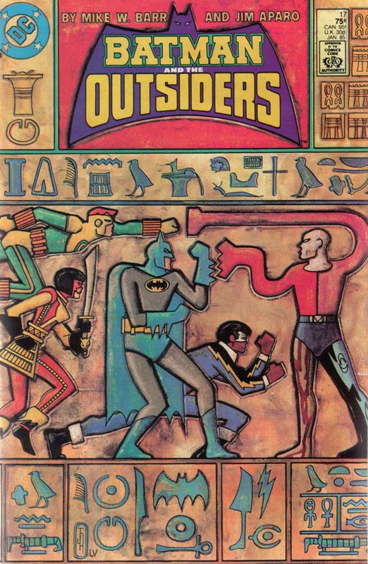
The Brave and the Bold was replaced in 1983 by Batman and the Outsiders he co-created with writer Mike W. Barr and was a really fun comic and one of my favorites at the time. On the surface the cover to issue #17 is pretty straight forward with the story based on an Egyptian villain and Aparo using Egyptian hieroglyphics as the cover was a really great idea. The cover itself is to me a really iconic piece that stands the test of time. Just looking at the cover gives you an idea of the story inside and the color work that gives the art a great distressed look is very impressive for its time when most mainstream color work was limited by printing at the time. Aparo’s layout here is one of the key elements and his bold and thick line work here is simple yet detailed at the same time. What pulls it all together is Varley’s color work that gives the cover a great aged look that makes you really take note of the detail that she put into the color artwork. This is a cover that is a perfect blend of line art and color art. It’s a bold and striking cover that you will remember for many years to come just like I did and still do.
Here is where there is a really interesting back story to the cover. Year ago at the San Diego Comic Con back in 1985 I ran into Frank Miller and his wife at the time Lynn Varley (pre Dark Knight Returns) and was talking to him about how much I loved Ronin and how at the time it was misunderstood and it was ahead of its time. We talked about comics and coloring and I mentioned the Batman and the Outsiders cover and Varley said that it was funny that I mentioned it because she colored the cover. She had seen the art come into the DC offices and was wondering who was coloring it because she had some ideas for it. She actually painted the colors and gave it a distressed look to give it the perfect aged look to match the time period and the aging process that would affect the coloring over time. She said that she lost money on the cover because she spent much more time than a normal color job was but she believed in the art and the colors would make it work that much better. She got a note from Aparo saying that he really loved the work that she did for the cover and sent her the original artwork as a gift for her great work that he appreciated.



0 Comments