We’re back with lots of new comic book reviews to get to. This cover both this week and some of last weeks comics. I hope to get to more but there were so many to read and there is just so much time I have to read them and then try to review them. I hope to add a few more catch up reviews over the next few weeks. Se let’s get going!
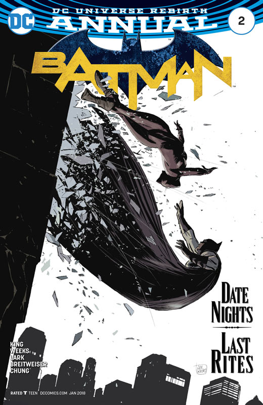
Batman Annual #2
DC Comics Writer Tom King, Artists Lee Weeks and Michael Lark, Colorist Elizabeth Breitweiser & June Chung, Letterer Deron Bennett
Over the past few years King has really elevated at a must read writer and his work on the regular Batman book has been very impressive, but this might just be the best story he has written to date. The thing that is most impressive about this story is that he goes back to the old days when an annual was cause for celebration and was a great stand alone story that was a treat for both new and old readers every year. The best part about the story is that it’s so much fun and lighthearted that will make you smile and that is tough to do with Batman. It’s a simple cat and mouse story but in this case it’s the cat and the bat with Selena up to her old playful tricks here. Now I wont spoil anything here but the “epilogue” to the main story is a real heartbreak and something that you don’t see coming but leaves you all that much more satisfied. What King really excels at as a writer is the way that he is able to capture the subtle details and the emotions of the characters that make this particular story so wonderful. Having a great story is one thing but to create a truly great comic book you need an artist that is about to bring the words on the page to life and in this case King is very fortunate to have not one but two brilliant artists bring this story to life on the page. Weeks and Lark bring this story to life in such a great visceral way that give the story a great rhythm and flow that is simply pure magic. Is the raw emotions of the story where the art really shines. The subtle elements of the story are in every line of the art that makes this story really hit home. Breitweiser and Chung do a fantastic job on the coloring of the book and complement Weeks and Lark’s line work perfectly.
Is this book worth your time and money? I have read hundreds of Batman stories over the years but this one is simply one of the best. What I loved the most about it was that King tell a simple story exceptionally well and that is why it works. You’ve read this story a million times but you just have to tell it well and that is what the team here has done. This is simply not only a must read comic but one that will stay with you for a long time to come. HIGHEST RECOMMENDATION!
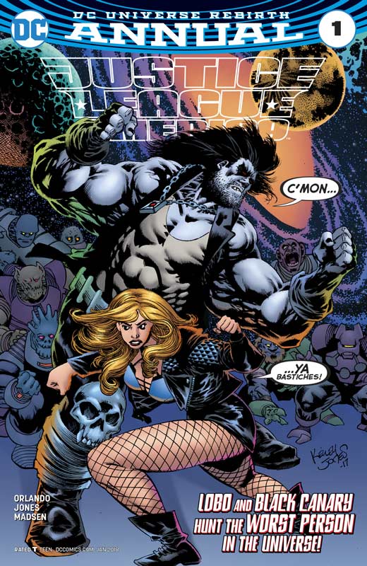
Justice League of America Annual #1
DC Comics Writer Steve Orlando, Artist Kelley Jones, Colorist Michelle Madsen, Letterer Josh Reed
Being a fifth week month DC has put out a number of Annuals this week to fill the void of their regular books and gives readers a chance to sample some titles that are good one and done stories and allows for some great artists to work on these specials. Regular series writer Orlando has the drawn the lucky straw with getting one of my all time favorite artist Jones to draw this story and it’s quite a treat. Orlando tailed the story for Jones by starring Lobo but I loved his out of left field choice of Black Canary as the sidekick. This adds a great spice to the story that surprised and delighted me. The story is pretty basic but having Lobo having a special moment with the space dolphins was truly priceless. He makes sure to throw in all of the things that we love most about Lobo and then having Canary not putting up with his shit give the story some real magic moments. Orlando plays the story fast and loose with some nice twist and turns but wraps it all nicely up by the end. Jones gets to have some great moments with his wonderful artwork here and gets to do some rare comedy moments and his kid Lobo look was perfect and a real standout in the story. Jones is a well know horror artist but this story allowed him to brighten things up from time to time and gave his some great moments to play with elements that are very enjoyable. I really enjoyed his visual take on Canary that gave here a different feel than other artists have given her over the years and he made her more of a badass that I really liked. Madsen has been coloring Jones work recently and turns in another stunning job here. Coloring Jones work is a very tricky job with his heavy blacks and thick line work but she knows exactly where to use and not use color along with her tone work makes this book really pop!
Is this book worth your time and money? I would by the yellow pages if Jones did the artwork for it but the good news is that Orlando has written a fun little story here that uses his art to fit the story and that is what makes this book so much fun. Having a writer know what the artist can do can help a book and in this case it works perfectly. It’s a solid read and the gorgeous artwork seals the deal. VERY RECOMMENDED!
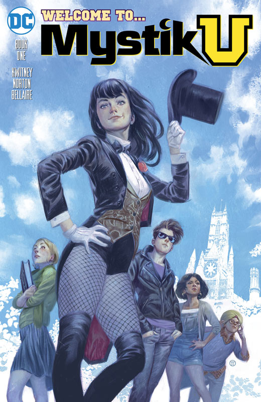
Mysitk U #1
DC Comics Writer Alisa Kwitney, Artist Mike Norton, Colorist Jordie Bellaire, Letterer Deron Bennett
I was a little scared with the first part of this issue seemed to be falling into the Harry Potter/Gotham Academy territory but I have to give Kwitney props for taking the story in a direction in by the end of this first issue that pleasantly surprised me. While there are still shades of the above references she did a good job of introducing the cast and setting up the story nicely in this first issue. The mystical characters in the DC Universe are ripe for the picking and Kwitney has done her homework nicely here. The book does visit the dark side a lot but she makes sure to give the story some nice levity along the way that evens things out well. Her work as an YA author shows here but that is a good thing because she make the story accessible to both new and old readers and this book makes a great gateway for non comic book readers that gives them a nice taste of what comics are like. Norton does a nice job on the artwork here and while not super flashy, it does however gives the story a solid visual footing that complements the story very well. He captures both the light and dark tones in the story well and give the characters nice facial expressions.
Is this book worth your time and money? I ended up really liking this first issue and Kwitney give readers a good reason to come back for the next issue. While the book didn’t necessarily blow me away I did however find it to be quite charming and enjoyable. Norton’s artwork fits the story nicely and helps make it an enjoyable read. If you are looking for something a bit different in the DC Universe you should give this book a try.
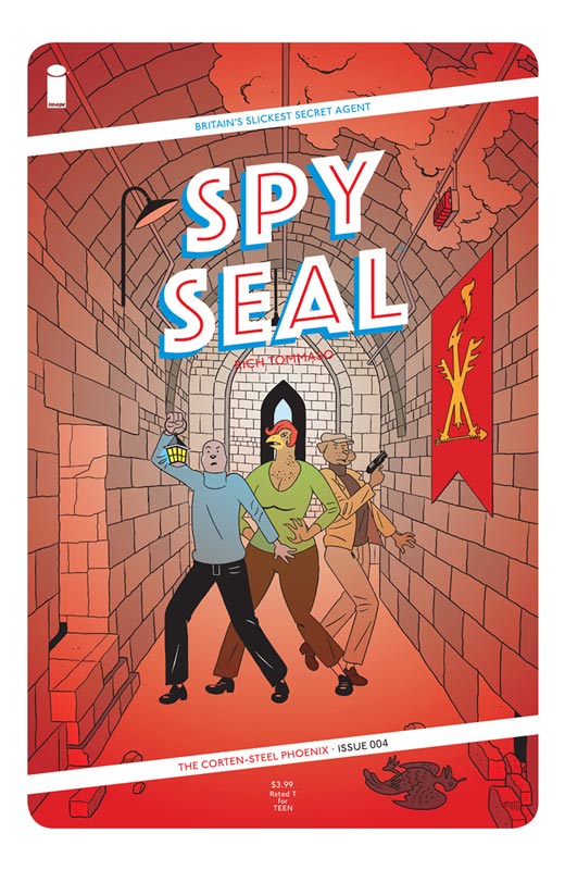
Spy Seal #4
Image Comics Writer/Artist/Colorist/Letterer Rich Tommaso
The final part to this first story arc wraps things up nicely but leaves some nice threads for the next storyline. There are so few spy comic books anymore that makes this book that much more of a treat. The one thing that I have really enjoyed with this story is the humor that Tommaso throws around in the book that really adds to the charm of the story. As I have said from the beginning is that Tommaso has infused this book with a great European flavor in both story and art that has made it such a treat. He has crafted a good old fashion spy story with all of the elements perfectly blended together for an enjoyable read. The story has a great depth to it but Tommaso makes sure that it’s never gets too dense and overwhelming. I have been really digging his artwork on the book that gives the book a distinctive and unique flavor that I love and works so well for the story.
Is this book worth your time and money? If you haven’t been reading this wonderful book than shame on you because your missing a fun and exciting spy story that is like a great James Bond story but with funny animals. Tommaso has crafted a wonderful world that I can’t wait to go back to next year. If you missed this book make sure to pick up the trade of the four issue that should be available soon.
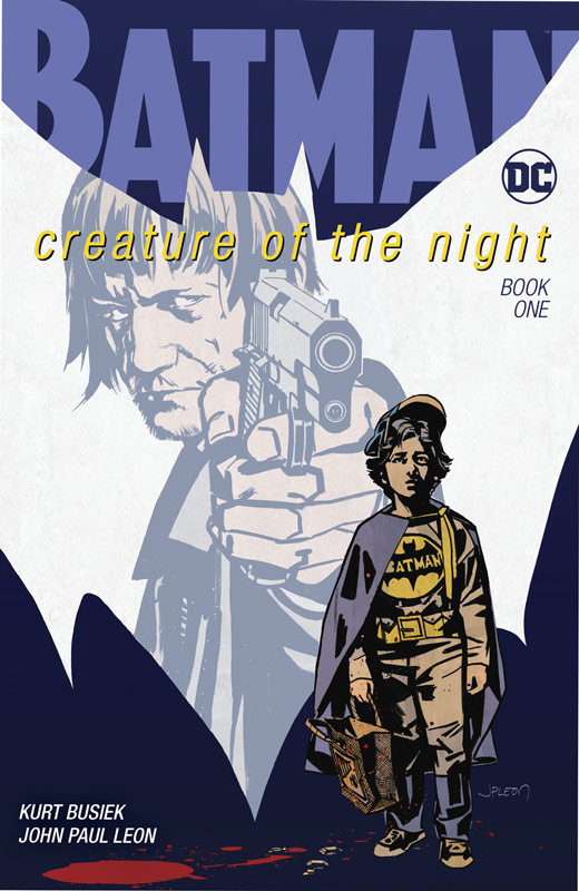
Batman: Creature of the Night #1
DC Comics Writer Kurt Busiek, Artist & Colorist John Paul Leon, Letterer Todd Klein
It’s been a while since Busiek has played in the DC Universe but he comes back with this great story that has been well worth the wait. In a lot of ways this is an Elseworlds story that basically retells the Batman Origin but from a different point of view and that view is extraordinary. I find it interesting when you tell a well-known story from a different point of view and Busiek does that very well in his writing. It’s almost like reading Batman’s origin for the first time and that is not an easy task. The other thing that is impressive about this book is the layers of emotions that he gives the story and makes for a real page turner on this one. I don’t want to give anything away but I will say that there are so many great twist and turns to this familiar story that will both surprise and delight you while your reading it. Busiek couldn’t have gotten a better artist than Leon on this book. He brings a great gritty style that serves this story perfectly and gives it a visual heart and soul that just really brings this story to life. I have to point out Klein’s stunning lettering in this book that is simply artwork unto itself. The way that he blends it with Leon’s artwork is a testament to his talent as the premier Letterer in the industry. It really complements both Busiek’s story and Leon’s artwork.
Is this book worth your time and money? It’s rare to see a comic book that fires on all cylinders but the team of Busiek, Leon and Klein have combined their talent into one of the best alternate Batman stories in years. It’s a book that you really feel while your reading it and washes over you and leaves you with wanting more. This simply is a must read comic book and gets my HIGHEST RECOMMENDATION!
Reactor #1
Vault Comics Writer Donny Cates, Artist Dylan Burnett, Colorist Dee Cunniffee, Letterer Taylor Esposito
This is one of the title from the new publisher Vault Comics and while this book is a tad wobbly there are some good ideas here and shows promise. In a lot of ways Cates story is something that has been told many times before and while there are not that many new ideas here he does give it enough to make it worth reading. One of the big problem that I did have with the book was that there was little character development and they were pretty basic tropes that did hamper the story. Ironically one of the issues is that the exposition is a bit on the short side and most of the issue is pretty mindless action. While that makes for an OK read there is not much meat on the story bone here. Burnett’s artwork is pretty good here and while there are some inconsistencies here and there overall it looks pretty decent for a small first time publisher. He needs to work on his perspective a bit but there is nothing that takes you out of the story and that is a very good thing. The coloring on the book is a bit garish and flat that doesn’t help Burnett’s line work at times.
Is this book worth your time and money? I thought that the book was OK. There are some fair ideas here but the problem is that Cates stumbles with this first issue and doesn’t give you a huge compelling reason to come back for more and that is not to say that the book is bad because it isn’t but with so many comics being published today the book doesn’t have a great hook to bring you back. There is just not enough here to recommend it.
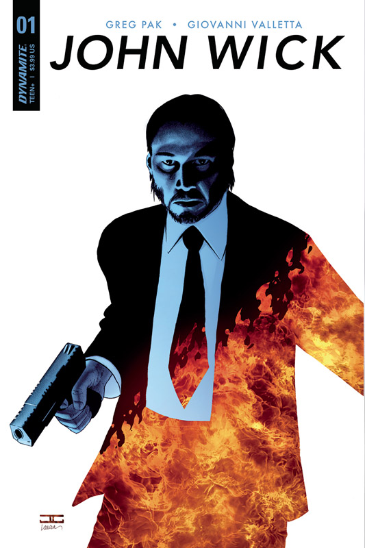
John Wick #1
Dynamite Entertainment Writer Greg Pak, Artist Giovanni Valletta, Colorist David Curiel, Letterer Tom Napolitano
I’m not the biggest fan of the John Wick movies but was willing to give this comic a chance because it would tell Wick’s back story and I thought that could be interesting. Pak’s writing can run hot and cold with me but I have to say that he give this first issue a solid footing and should please fans of the films. On the other hand there is nothing groundbreaking here at the same time. Much like the films that the book is based upon there is not a hugely deep story here. Pak does fit in some nice moments in the script but there was nothing that really bowled me over in the end. The disappointment was in the art department and Valletta’s art is not terrible but it is pretty flat and stiff that doesn’t really help the book at all. While it’s a bit better than an average Dynamite title that bar is pretty low here. There is a lack of backgrounds that is very noticeable and there are a number of time where the lack of detail takes you out of the story. Overall not the worst but it’s not going to impress anyone either.
Is this book worth your time and money? If you’re a fan of the John Wick movies your probably going to like this book but other than that there is not a lot for anyone else. Pak’s script is decent but doesn’t bring anything super compelling to the mythology. And when you add in the middling artwork there is not much to praise this book for. SKIP IT!
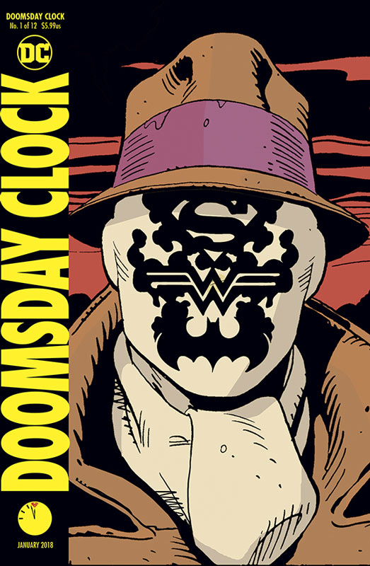
Doomsday Clock #1
DC Comics Writer Geoff Johns, Artist Gary Frank, Colorist Brad Anderson, Letterer Rob Leigh
Well it’s finally here and I’m not sure how to feel about it. I think the big thing is that honesty reading this first issue is pretty much Watchman II and I’m not sure that there is more story needed. I will give Johns that he did his homework and tries his best Alan Moore imitation here and while I liked this first issue, I’m not totally sure how I feel about it. I think the bigger question is do these two universes need to be together? Now I will say that I didn’t have a problem with the Before Watchman books that came out a few years ago nor do I have a problem with other creators telling stories about these characters. Does it negate the original series, no but a pure sequel is a very iffy proposition to say the least. This first issue is pretty dense and the pace is pretty slow so it’s really hard to get a sense of what the book is going to be. I will say that the last act of this first issue with Superman was quite good and worked better than the Watchman first part. The one thing that the book does deliver well is with Franks’s artwork that is a huge plus for this book. While he does use the nine panel Gibbons Watchman layouts he wisely doesn’t try and mimic his style that could have turned into a complete disaster. Frank is a great artist and this alone is worth buying the book for. The big question is that going to be enough?
Is this book worth your time and money? I honestly not sure what to make of this book with this first issue. I don’t know that I want to just see a Watchman clone that the first 2/3 of the book is but the Superman sequence was quite good. So where does this leave us? Well it’s definitely going to take a few more issue to see how this all sussed out. The one thing that I do know is that Frank is an amazing artist and the book looks amazing but the story is a bit of a head scratcher. If your interested then you should pick the book up but if your on the fence then I can’t really give you a real recommend or skip it quite yet.
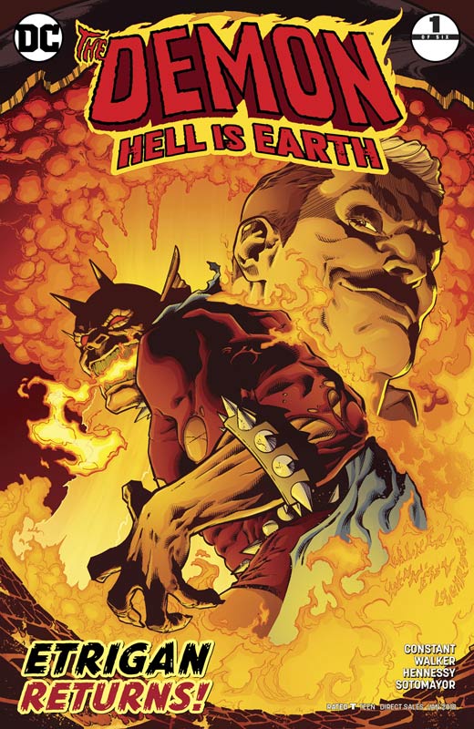
The Demon: Hell is Earth #1
DC Comics Writer Andrew Constant, Penciller Brad Walker, Inker Andrew Hennessy, Colorist Chris Sotomayor, Letterer Tom Napolitano
Jack Kirby’s Demon has always been a tough nut to crack on a solo book. The one that does stand out is the Matt Wagner mini series from 1986 was a great read but the subsequent series lacked that Wagner magic so I was looking forward but hesitant at the same time about this new mini series. While not perfect Constant gets this first issue off to a good start with an interesting idea out of the gate. He dispenses with Etrigan origin that can both good and bad depending if your familiar with it. I did however like his set up to the story that not only plays well with Jason’s duality but also not revealing everything at once that leaves some nice mystery for the upcoming story. Throwing in Madame Xanadu was a nice little touch that should payoff nicely with her start in this first issue. Walker and Hennessy deliver some very nice artwork here with nice detail and great facial emotions along with a very impressive visual look to Etrigan and they give this book a great solid footing that moves the story along quite well.
Is this book worth your time and money? While the book didn’t blow me away, it did however give me a good reason to come back for a second issue that many comics don’t achieve. Constant sets things up well in this first issue and with the strong artwork by Walker and Hennessy make this a comic that is well worth checking out.
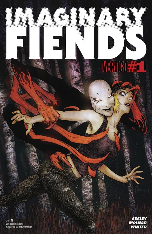
Imaginary Fiends #1
Vertigo Comics Writer Tim Seeley, Artist Stephen Molnar, Colorist Quinton Winter, Letterer Carlos M. Mangual
Vertigo has had a rough road lately and that is not to say that the quality of the books have been bad but sadly a number of great reads have sold poorly and that is a shame because I’m hoping that Imaginary Friends doesn’t fall into that category too. Seeley script is a solid first issue that does a nice job of balancing exposition with moving the story along quite well here. One of the best assets of the script sets up the characters very well with especially Melba that is one of the reasons that the story works so well. By taking the time to lay the foundation for the story Seeley succeeds where many writers fail on their first issue. He give you reason to care for the characters and that is one of the reasons why the book gets off to a good start. Molnar’s artwork on the book was good and while there some minor inconsistency early in the issue that I noticed but he really hits his stride as the book goes along and the introduction of Polly Peachpit is very well done. By the end of the issue he does a very fine job on the artwork. I am interested to see him grow over the corse of the series.
Is this book worth your time and money? I really liked the concept here and it will be interesting to see where Seeley and Molnar take it from here. There is good reason to come back for a second issue with a nice cliffhanger at the end of the issue and with the solid foundation in this first issue it’s well worth checking out.
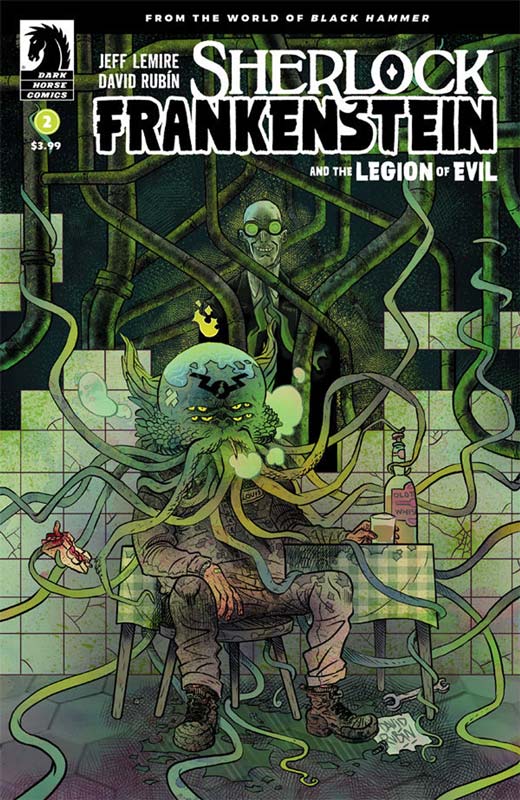
Sherlock Frankenstein and the Legion of Evil #2
Dark Horse Comics Writer Jeff Lemire, Artist/Colorist/Letterer David Rubin, Flats Kike J. Diaz
Every time I think that Lemire can’t top himself, he goes and does it again with this amazing second issue of this mini series side story from the Black Hammer Universe. This issue really knocked my socks off because he sets up Cthu-Lou as this super monster only to have Lucy find out that he has given up being a super villain and to find out he’s just an average Joe. But where thing really become heartbreaking is his daughter Louise that is the cutest little monster that you have ever seen and that scene in the book is one of the most heartbreaking things I have read in quite a while. He also takes us deeper into the mystery and leaves Lucy in a cliffhanger that is going to be really rough waiting a month to see how in unfolds. Lemire continues to take the Black Hammer Universe to new heights with every single issue and this mini series with just two issues in has taken readers on an emotional roller coaster ride and there is still more to come. Rubin is knocking this book out of the park with his gorgeous artwork that captures the big moments so well but it’s the small delicate touches that drive the scripts emotions home.
Is this book worth your time and money? Simply put Black Hammer and now this Sherlock Frankenstein mini series is one of the best superhero comics being published now. A lot of the time spinoff mini series seem like cash grabs but not with Lemire and Rubin who make this such a joy to read and expands greatly on the main Black Hammer book but stands alone quite well on its own. Few comic are a pleasure to read but this is certainly one of them. HIGHLY RECOMMENDED!





0 Comments